Cumberland Country Craftsman
Story Jody Scully | Photography Gordon King
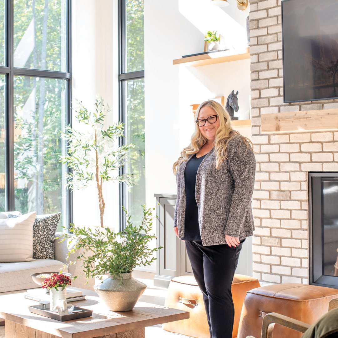
With sweeping views of the property and an abundance of natural light, it’s easy to see why the family sitting room is a favourite space in the home.
Mandie and D.J. Robertson had a longstanding dream of constructing a home outside the city limits. More than a decade ago they purchased a property in Cumberland with hopes of one day building their family home there. It was the pandemic that eventually afforded them the time and opportunity to initiate the planning phase.
With two young children and busy careers (Mandie, a psychotherapist and co-owner of Robertson Therapy, and D.J., the operator of Robertson Rent-All, a family-owned equipment rental company), the couple realized they definitely needed some expert guidance. That’s when they brought designer Lindsay Wolfe-Assaf of The Home Stylist on board.
Lindsay was instrumental in helping them with the overwhelming number of decisions that come with building a new home. “With it being fully custom, the options were endless, and we really needed someone to help narrow it down,” says Mandie.
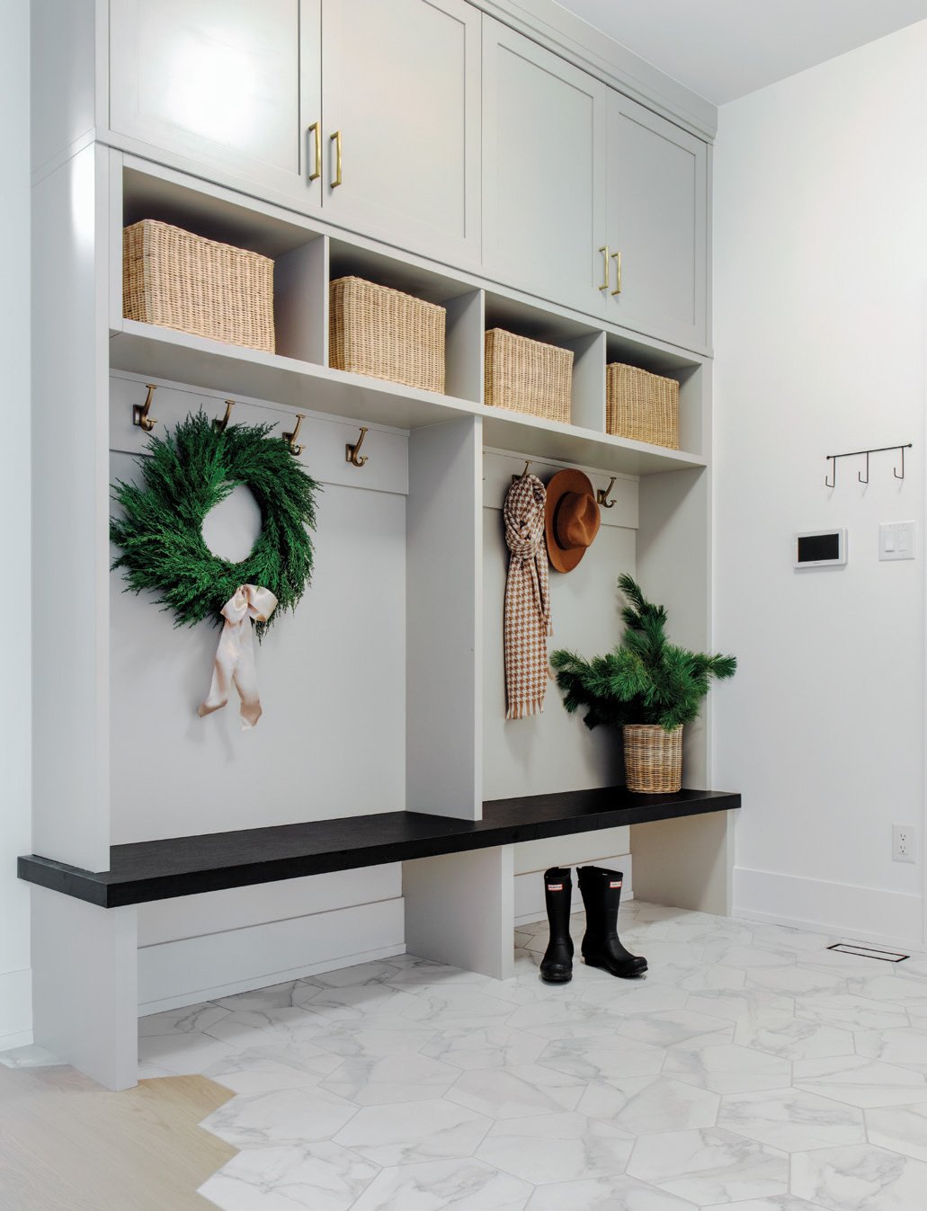
A functional and stylish mudroom helps this busy family stay clean and organized. Each item of the home has been meticulously curated and styled to create a space filled with warmth and class.
The homeowners chose Pagi Construction as the home builder. Pagi provided the initial floor plans and worked collaboratively with Lindsay and the homeowners to finalize the details. “Projects are always more successful when you have a cohesive team that works together from the beginning to the end of the project,” says Lindsay.
She credits the success of this project in part to their great relationship and the trust they placed in each other. “We trusted Lindsay’s vision because she’s got a better eye for design than either of us and it worked out really well,” says Mandie.
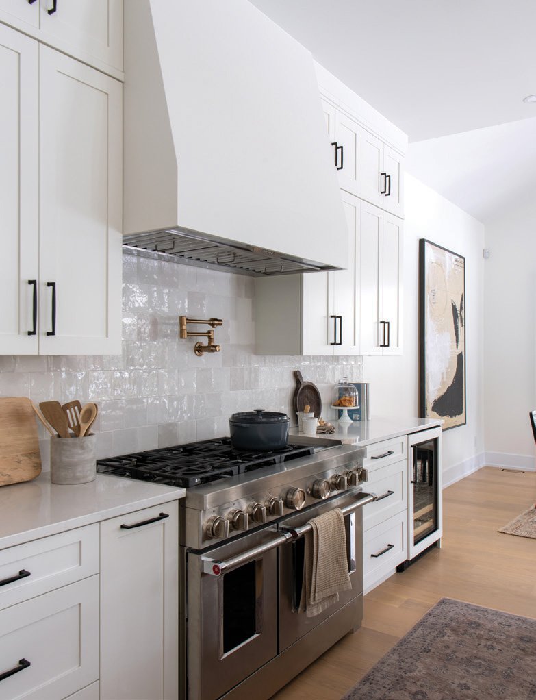
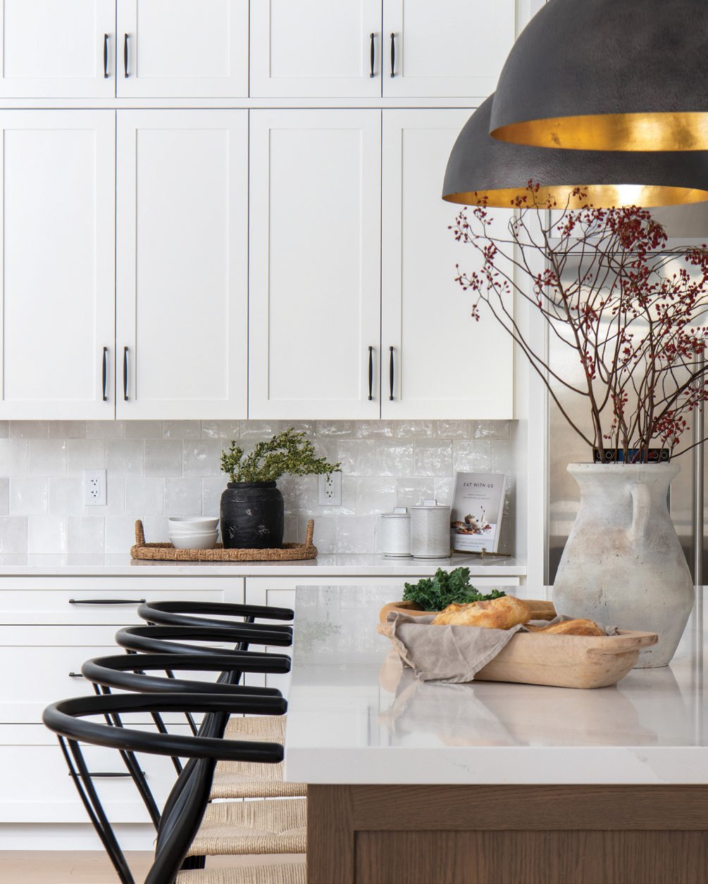
An open-plan kitchen easily allows for a functional space for the young family. Soft neutrals and natural wood tones create a beautiful balance of materials.
The home’s exterior is craftsman-style with rustic touches, which the homeowners have cleverly dubbed “country craftsman.”
It was important to them to keep as many of the trees as possible to maintain the “country feel that’s so nice and reminiscent of our childhoods,” says Mandie.
Inside, the home is flooded with beautiful light and uses natural materials almost exclusively. A serene neutral colour palette of white, greys, gold, and wood tones runs throughout the home. “We tried to keep it consistent so it would flow really well,” says Lindsay. “When you have a big house, if there’s too much variation, it feels choppy and all over the place.”
Two-storey cabinetry (Boiserie Sébo Woodwork) helps to draw the eye upwards, making the space feel larger, while also providing ample storage solutions. No details have been left behind. Beautiful tile (Wagner Tile) elevates the kitchen and reflects the natural light, illuminating the space.
All the cabinets and built-ins by Boiserie Sébo Woodwork feature the same door style and consistent black or brass hardware. Stunning tile is another element that’s constant throughout the house. From the kitchen to the mudroom to the bathrooms, each space features intricate tile work with an unexpected twist and flawless installation courtesy of Wagner Tile.
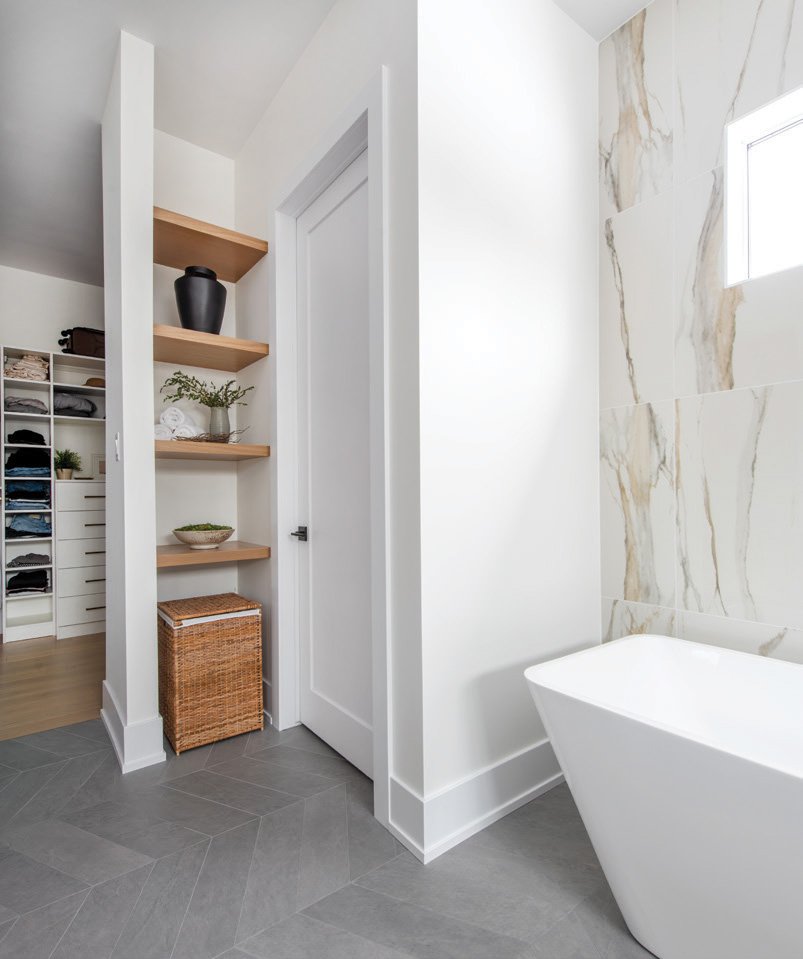
Lindsay skilfully used shape and texture to add interest and elevate each space. “We really played with shapes a lot in the house. We picked grey tile, but instead of a rectangle, we used herringbone and hexagon tile,” she says.
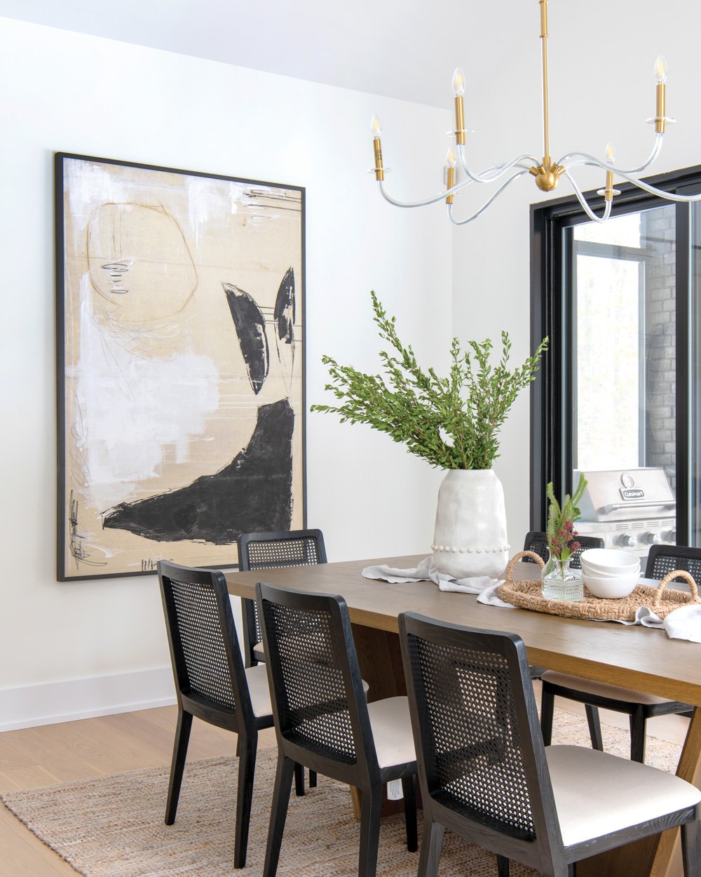
The open-concept kitchen/dining space allows for varied seating options while entertaining or just hanging out as a family.
The designer loves to incorporate details that make the home unique while ensuring the material selections remain timeless and flow together. The seamless transition between the mudroom tile and the white oak hardwood floor (BH Floors Ottawa) is a great example. Mandie was hesitant about the unconventional design choice but Lindsay convinced her to step out of her comfort zone and it turned out to be one of her favourite features. “Lindsay really encouraged us to trust the process and go with some different design elements that I might have been too scared to incorporate,” says Mandie.
Custom cabinetry provides symmetry to this home office while also incorporating savvy storage solutions to help keep the space neat and tidy.
When asked what she loves most about the house, Mandie says it’s difficult to choose because she’s so happy with everything. “I love the kitchen, but my favourite space is the living room with the floor-to-ceiling windows. Every time I’m in that space, I just feel good.”
And it’s easy to see why this room holds a special place in Mandie’s heart. The soaring ceilings and two-storey wall of windows (Marlboro Windows & Doors) create an indoor-outdoor connection that leaves you feeling as if you’re sitting in the forest.
Neutral colours and soft touches turn this primary bedroom into a serene escape.
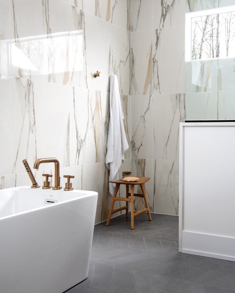
The primary bedroom has the same bright, open and airy feel. Draperies over the large window are from Linen + Lining. The goal was to create a simple and calm space while also incorporating some bold touches, like the large-scale bathroom tile (Euro Tile & Stone). “We kept a neutral palette and added texture with the carpet, light fixtures and fabrics,” says Lindsay. “We wanted the timeless look of marble, but with a bit more of a wow factor.” A large oak vanity brings warmth and balance to all the tile, with the large windows placed high on the wall to allow in plenty of natural light without sacrificing privacy.
A gorgeous oak double-vanity adds warmth to the space, eloquently balancing the tilework and dark grey patterned flooring. Large-scale tile (Euro Tile & Stone) creates a bold and elegant statement in this primary en suite.
If she had one piece of advice for someone starting out on their own custom build, Mandie says it would be to hire a designer. “I don’t know how you could do it without someone to guide you and keep you on track. It’s a must,” says Mandie. Lindsay seconds that thought. “When you’re doing a custom home and spending so much money on an architect and builder, you want to make sure you’re also investing in good design decisions you won’t have to fix later.”
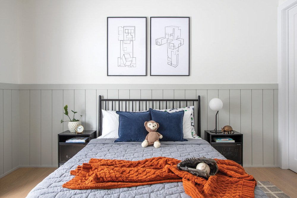
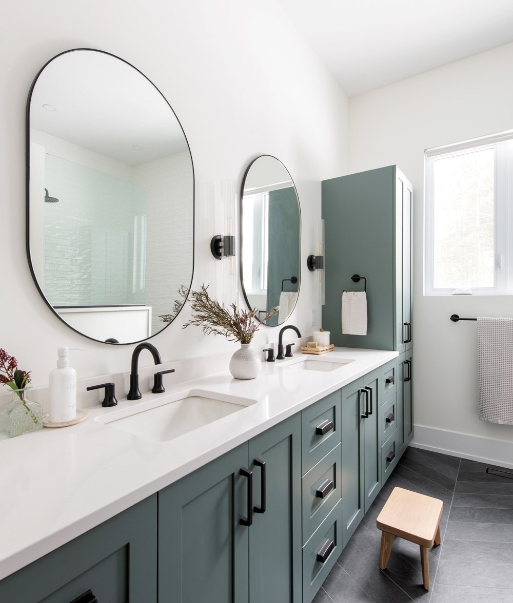
A children’s bedroom with a calming colour palette of greys and blues provides a quiet, relaxing space to sleep and play. A double-vanity in a serene blue-grey shade adds an element of visual interest to this bathroom.
When asked about her design philosophy, Lindsay says, “I want to make sure that hiring me is a good investment for my clients. We can have fun and play with colours and textures, but I also want to retain the value of your home 10 years from now. I want to make sure everything stands the test of time.” OH
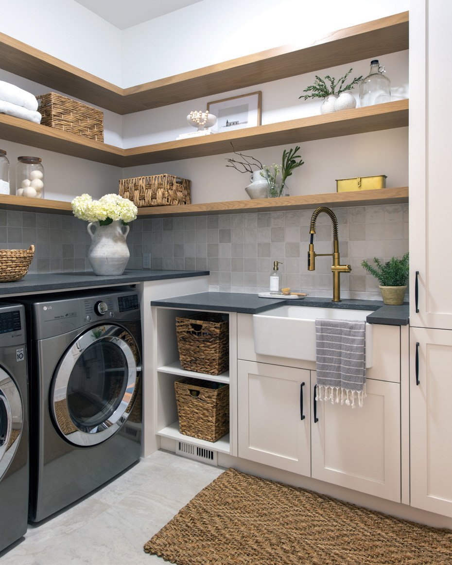
A laundry room made beautiful! Open-shelving and intricate tile work add flair to this room.


