Sky High Style
Story Heather Wright | Photography Gordon King
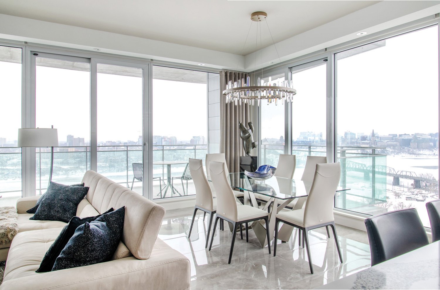
The shared living-dining space offers unparalleled views whether you’re cooking, eating or relaxing.
In this Gatineau condo, perched high in the sky, wrapped with luscious views of parliament hill and the Ottawa river, the eye is drawn outward. However, this stunning condo’s style secret is underfoot, which is where the whole design, and its dramatic details, began.
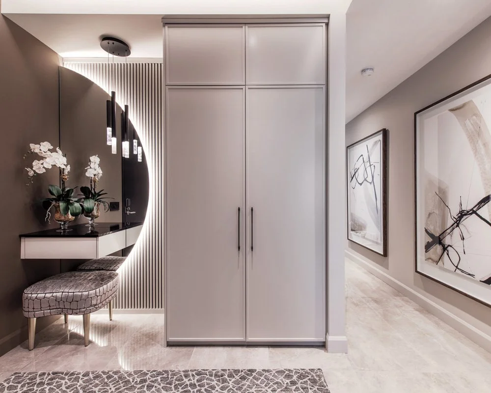
This stylish entryway departs from the typical, adding a unique touch while seamlessly blending function and style within the glamour theme.
Louise Cardinal of Louise Cardinal Concept designed the condo together with her daughter Claudel Cardinal. The oversize tile floor (Euro Tile & Stone) that runs throughout this one-bedroom-plus-den condominium was the base for the entire design, she reveals.
“The first thing we picked was the floor,” says Louise. “It is the same flooring throughout the condo. And everything was built around these big tiles with shine to them.”
Claudel Cardinal and Louise Cardinal of Louise Cardinal Concept. Christian Guibord of Millstrong Cabinets Inc.
This project marks the third that Louise and Christian Guibord, of Millstrong Cabinets Inc., have done together over the years for homeowners Lyne Bellehumeur and Claude Génier. In a delightful working partnership, Louise develops concepts and Christian brings those ideas to life, much to the repeated delight of homeowners.
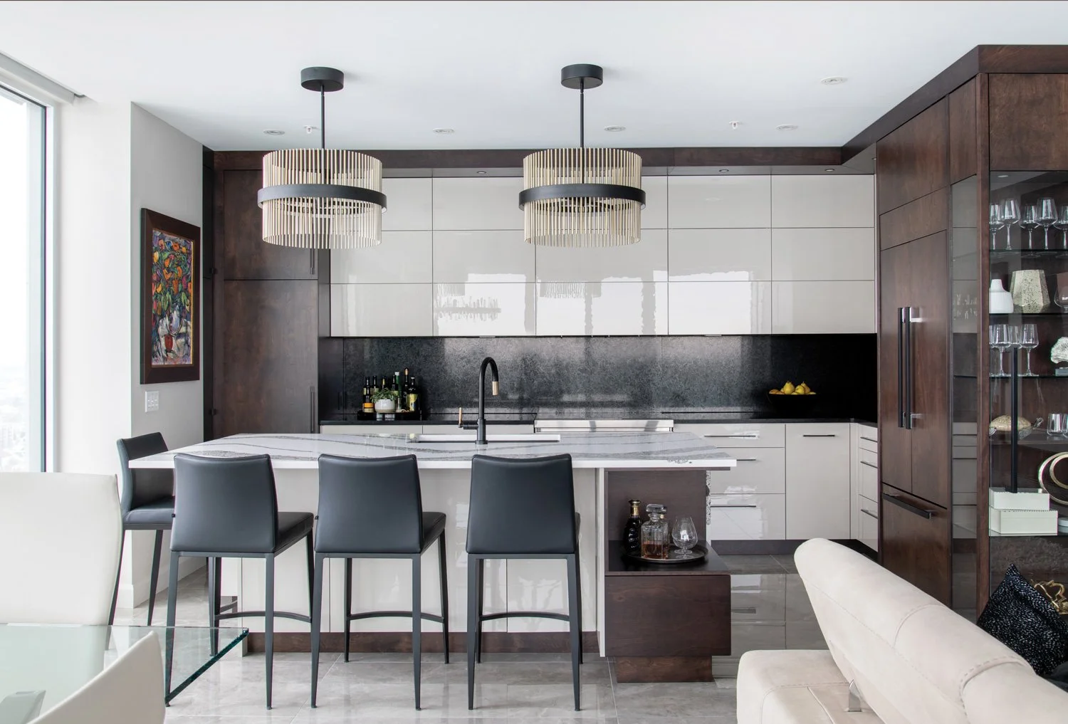
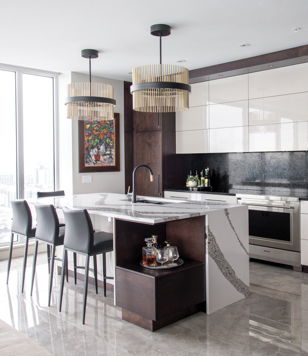
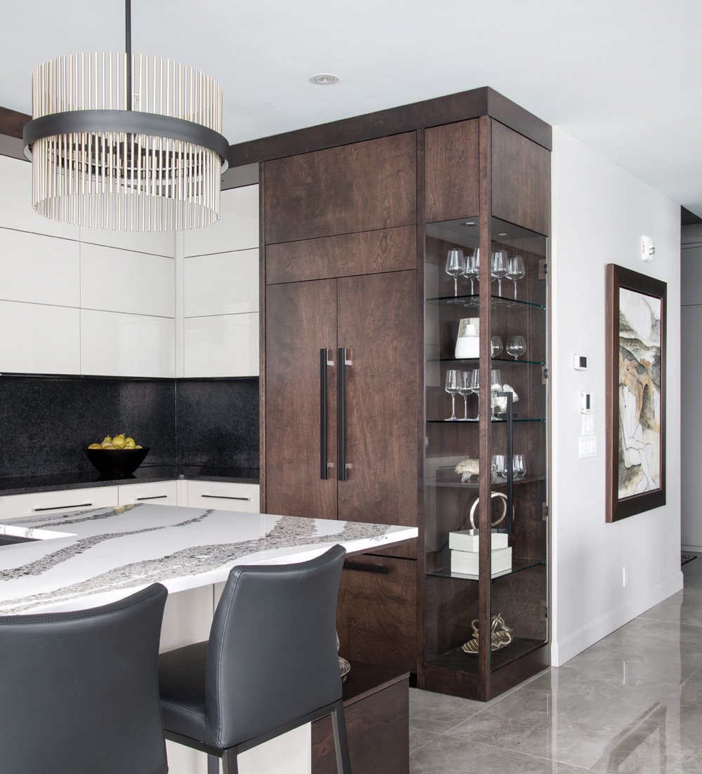
Dark wood paired with white gloss cabinetry provide an eye-pleasing contrast in this stunning kitchen.
The homeowners bought this condo on spec and called on Louise and Christian to alter the footprint to accommodate their needs, which included knocking down walls and taking what had been designed as a two-bedroom-plus-den condominium to a home that features a single stunning bedroom sanctuary and a rugged, but refined den.
Bold and glamorous design choices are seen throughout this gorgeous condo, including the gold-and-black pendant lighting above the island from EP Store. Attached to the custom-panelled fridge is a space-savvy curio cabinet, displaying beautiful glassware while also working as a storage solution.
“Everything has been thought out down to the smallest corners to maximize space, which is very impressive,” say the homeowners. Beyond reconfiguring the space, the homeowners expressed specific aesthetic criteria: timeless not trendy, with understated décor and sophisticated design choices. That describes exactly how this condo looks and feels after the renovations were complete, with the added bonus of incredible views, particularly breathtaking from their 22nd floor vantage point. The design specifically works to extend the views and usher in natural light that spills into the bright and beautiful condo through ample windows.
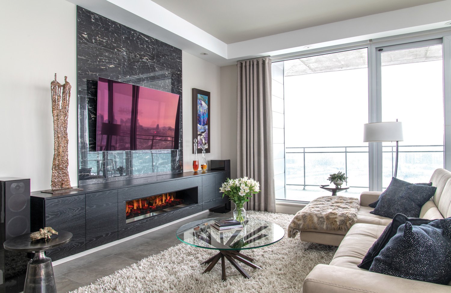
A sleek, low-lying fireplace provides warmth that contrasts with the tiled wall.
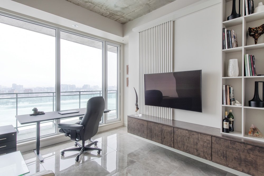
There are hints of old Hollywood glamour here, along with a slight brush of drama in the den, including a concrete ceiling, communicating purpose and ownership for each of these spaces, with a subtle dual vibe.
Upon entering the home, you are met with a unique, show-stopping half-moon mirror and closet in the front foyer. It’s a creative solution for clever storage that veers away from the ordinary closet appearance, adding a unique touch, easing into the glamour theme. The mirror and closet are the perfect blend of function and form, according to Christian. “They are well-designed, with beautiful colours, textures and provide storage,” he says. It is one of his favourite elements in the condominium.
Light-coloured flooring paired with dark wall tiles provide balance to this moody bathroom.
The same balance of purpose-driven style is struck in the kitchen, with high-gloss, flat-panel cabinetry (Millstrong Cabinets Inc.) that sits behind a striking island with Cambria quartz from Urban Quarry, anchoring the open kitchen. The upper cabinetry is particularly sleek with hidden electric door openers and a subtle sheen that plays well with all the natural light spilling into the space.
The den serves as a multi-use space for both working and relaxing, while also providing snazzy storage solutions.
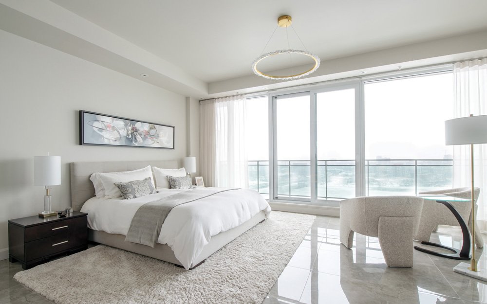
The spacious primary bedroom appears even more sizable thanks to clever design. Floor-to-ceiling windows offer sweeping views and lead to a large outdoor terrace.
They opted not to close the en suite area off with a traditional door, but rather used wall placement to divide, but still maintain privacy. “The idea was to have it open, so that everything looks bigger and brighter,” says Christian. “The toilet is still hidden so there is privacy.”
A spacious and serene bedroom is a relaxing space seeped in luxurious finishes and gorgeous design.
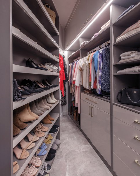
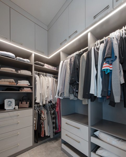
A two-way fireplace can be enjoyed from the bedroom, or while relaxing in the deep soaker tub from Mondeau. Completing the primary suite is an enviable walk-in closet (Millstrong Cabinets Inc.), with tons of storage, a must for carefree condo living.Working with a condominium presents certain challenges, especially when reconfiguring a footprint, because some functional aspects cannot be changed, such as the plumbing, therefore they worked carefully around these elements.
A two-way fireplace adds a creative touch to the room, making it enjoyable both from the bed and bath.
The other challenge was to maintain the flow of an open-concept floor plan, increasing a sense of space, while defining specific zones within the home and keeping design continuity throughout.
In addition to having the same flooring pulled throughout the condo, the paint colour, Sherwin Williams Agreeable Gray, was an important factor that tied it all together, says Louise. She selected the same hue to be applied throughout the home. “It’s not too cold, not too warm,” says Louise, saying that the size and placement of windows came into play with the paint decision because sunlight throughout the day – and throughout the seasons – would ultimately influence the appearance of the wall colour.
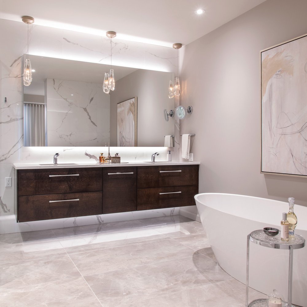
Elegance is present in every detail of this en suite. Designed to act as a glamorous retreat, the room features elegant design features like a standalone tub, floating double vanity with a backlit mirror and exquisite tiled walls.
The homeowners also have a lot of original art, so the wall colour choice had to be an appropriate backdrop for their art collection.
The light fixtures help to signal transition through zones in the main living areas, without interfering with sightlines or the view. They add visual texture, particularly the chandelier over the dining table, and the twin pendants over the island from EP Store.
The attention to detail in this home is truly remarkable. Each and every design decision harmoniously intertwines to enhance spaciousness, maintain a unified aesthetic, and ultimately transform this condo into a wall-to-wall masterpiece of glamorous elegance. OH

