Strike A Pose
Story Gina Makkar | Photography Jason Hartog

The 1980s were a time of bold prints and bright colours, when Madonna was queen and mauve bathroom tile, wall-to-wall carpeting and wallpaper borders were king. Plenty of existing interiors are still stamped with hallmarks of the era, and this home’s original design was no exception.

When homeowner Sandra Zuliani and her husband Sandro first walked through the space, they instantly realized the potential. “We don’t like cookie cutter homes, and never did,” says Sandra. “My husband said it needed a lot of work, but that didn’t intimidate us. It was beautiful, but beyond our budget. I said, ‘Some people have a house and a cottage. This will be our house – we don’t need a cottage with such spacious grounds with lots of greenery.’ ”

Michelle Major, owner and principal designer of Foxglove Design, worked alongside her team to transform the kitchen and living room from a dated 80s classic to a timeless and contemporary space.

The renovation centred on the tired kitchen, with its restrictive U-shape design. Sandra didn’t like how the kitchen was laid out and wanted something different. Originally, the team tried to work with the U-shape and offered options to transform the layout and incorporate the family’s must-haves.

When they explored removing a wall, Sandra hesitated. “My husband wanted to do it originally, and I should have listened to him, but all I kept hearing was load-bearing and it freaked me out,” says Sandra. As part of the process, the team worked with engineers to ensure the integrity of structural changes, a factor that helped put Sandra at ease. In the end, the wall came down and opened the space to reveal large windows and light. Foxglove’s systematic approach keeps the renovation process organized. At the end of a plan, drawings are complete, materials selected and everything is priced out. The trades have a scope of work and quotes for labour are in hand for a turnkey price for the project. In the kitchen, brown tones and yellow pine were swapped with fresh white. Upper glass cabinets with curved mullions add shape.

Some of the existing cabinetry was preserved and refinished on site to match the new additions. The deep grey of the island was chosen to marry with the warmth of the hardwood floors. Originally under the window, the sink moved to the island, creating more counter space. A marble backsplash in a herringbone pattern adds visual interest.
The island opens to a cosy sitting area, where a reclaimed-wood feature wall in shades of grey ties into the home’s new palette. “One of the key elements to the design that Foxglove did was this island,” says Sandra. “We only have three upper cabinets.” Michelle added storage in the oversize island. “It was the solution for more cupboards and counters, which are vital,” Sandra explains. “It solved all my problems and keeps everything at arm’s reach when prepping. To me, it was a huge design element that made a big difference.”

Prior to the renovation with Foxglove, the couple built an addition off the family room to create a separate space for dining. “Being Italian, when we bought the home, the first thing my husband said was ‘Where are we eating?’ ” A soaring cathedral ceiling and wall-to-wall windows create the feeling of a sunroom, and the original exterior-window opening between the kitchen and the new space creates a pass-through and allows additional light to flow.

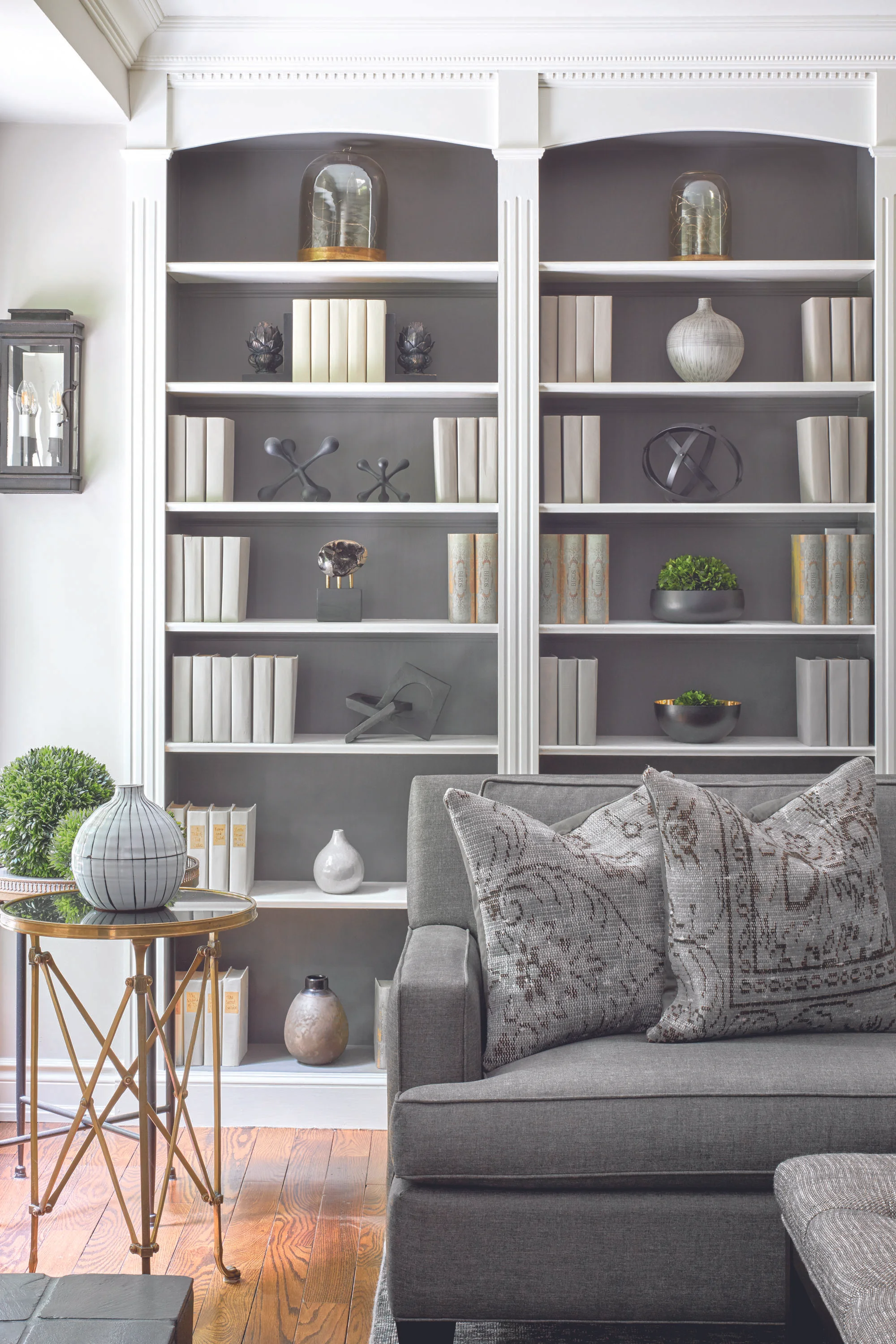
The adjacent family room was revitalized with a few simple changes. New windows offer more energy efficiency and maximize light, while the removal of popcorn ceilings and an updated colour scheme create cohesiveness. Square columns replaced the original round ones to mirror the shape of the kitchen cabinets. Integrated bookshelves and intricate crown moulding add detail. Furnishings with soft silhouettes complete the space.
The team also created a new lighting design for the main floor. “I think lighting is undervalued,” says Sandra. “People don’t consider it, and yet it’s huge.” Pot lights on the perimeters add ambient light and traditional fixtures add a touch of whimsy, one of Sandra’s favourite design elements. “I always look for things that are transitional and unique, but nothing cold. I like to add a twist of old-world charm. It’s warm and inviting.”

Down the hall, a media room, another of the home’s additions, features a beadboard cathedral ceiling and a painted brick wall. Graphic textiles add liveliness to the muted greys. The effect of the home’s overall aesthetic is warm and serene, a design that allows Sandra to add or take away colour as the mood strikes. “I get bored with certain design elements, and I’ve learned that you can accent with colour, accessorizing, editing and moving décor items around, which instantly changes the feel of a house.”
Sandra loves to style, update and organize, so adding touches to her own home was second nature.
With the renovation complete, the space exudes charm, character and function that will be in vogue for years to come. OH
