One Of A Kind
Story Catalina Margulis | Photography Gabrielle Rochon
The charming streets of downtown Burlington hint at the roots of this city, which in the early 1900s was a bustling agricultural region and port for produce distribution. The quaint neighbourhood with its age-old homes attracted Sarah Leon and Rob Stepenski to the area 10 years ago.
When the need for a larger home arose, it was a “love it or list it” scenario. The couple have two kids, and their cosy two-storey bungalow needed more functionality. A quick look around the neighbourhood made them realize they wanted to stay right where they were.
“We love this neighbourhood; there aren’t many places like it,” says Sarah. “Very few homes come up for sale and I don’t like driving. A home downtown means I can also walk to my appointments, to the kids’ doctor, the dentist, the GO train. Even when I have to drive, it’s only a five-minute trip. We live in a close-knit community and my parents live nearby, so we decided to take the plunge and do a renovation.”
The family came up against a few challenges. The small lot didn’t allow many options for expansion. What was initially a main-floor renovation turned into a one-year project to lower the basement, add an addition and fully renovate, top to bottom.
“It grew a lot in the process,” says Aric Bagshaw of NZH Contracting. “There was a lot of structural work that went into it. It was definitely a project full of changes.” Being an older home with a fieldstone foundation, the house ran into engineering obstacles along the way, requiring steel beams and additional footings.
Architectural designer Darren Sanger-Smith of Structured Creations helped bring the project together in stages. The final task list included a deeper basement and lower-level bathroom, a main-floor addition to expand the kitchen and great room, a laundry room, an additional bathroom on the second floor and a master bedroom with en suite on the third floor. Both Sarah and Rob work from home, so two offices were created. “I finally have my own office space and I’m no longer working in the kitchen with the kids,” says Sarah.
To finish the interior, designer Anita Puls of House of Hues Interiors came on board early. “There are very clean lines, with lots of white and high contrast. It’s the contrast element that adds the visual interest,” says Anita of the now-modern interior. “The whole house is white, bright and cheery.”
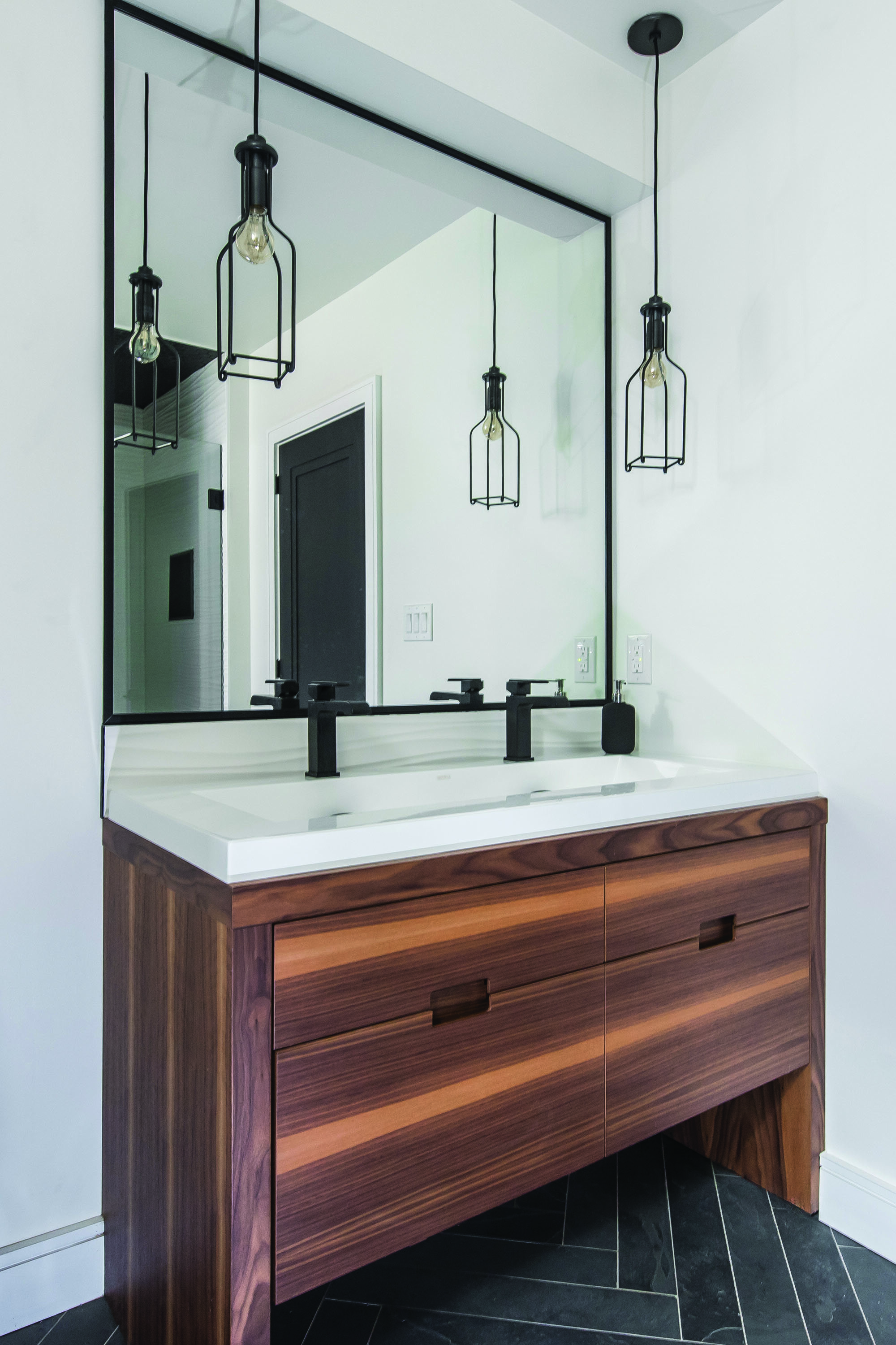
In the basement, a new bathroom makes a statement with black-and-white slate herringbone tile. A wood vanity, black faucets, pendant lights and black-framed mirror finish the space. The media room features a large sectional and a custom console that resembles a bar.
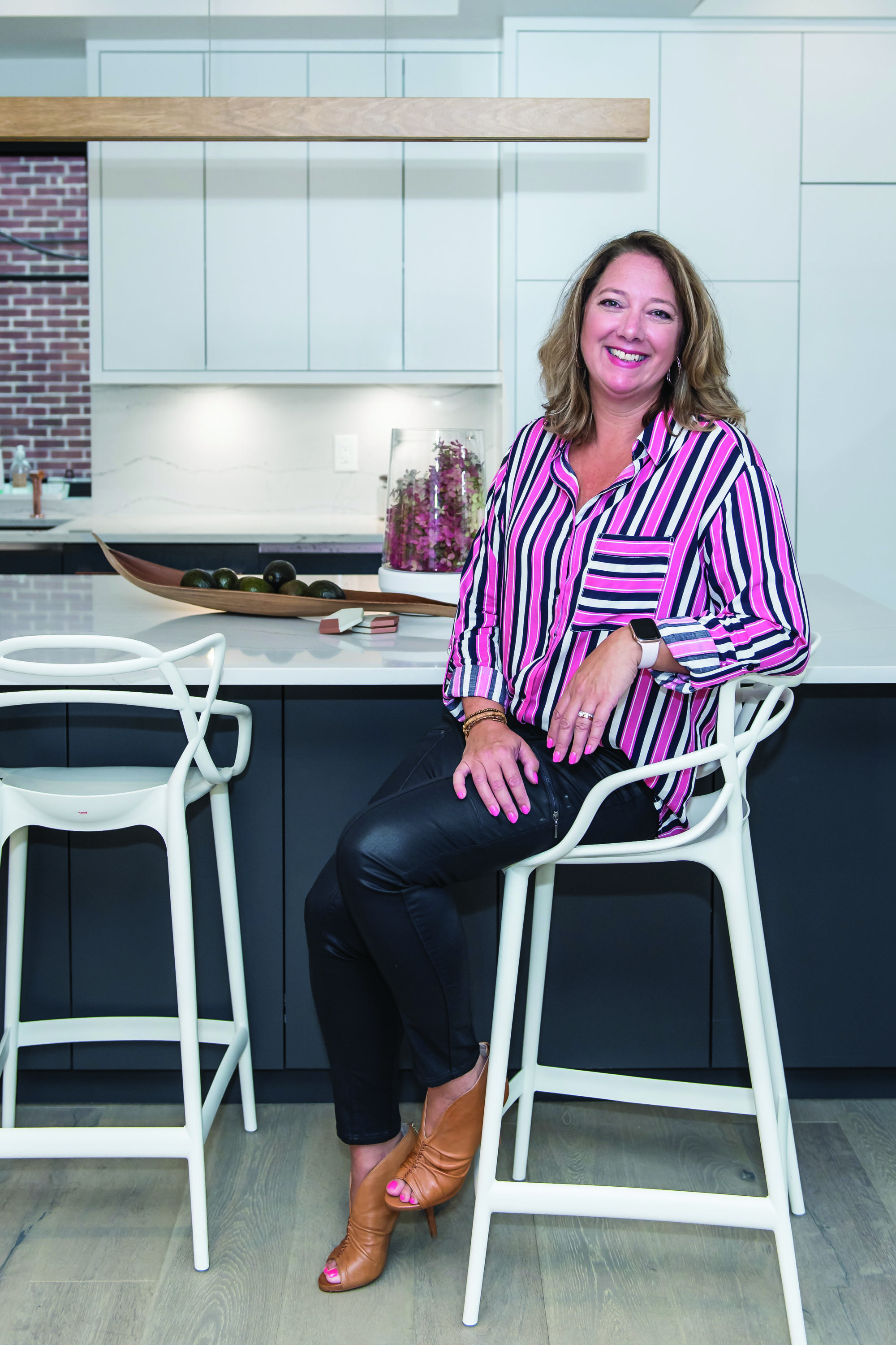
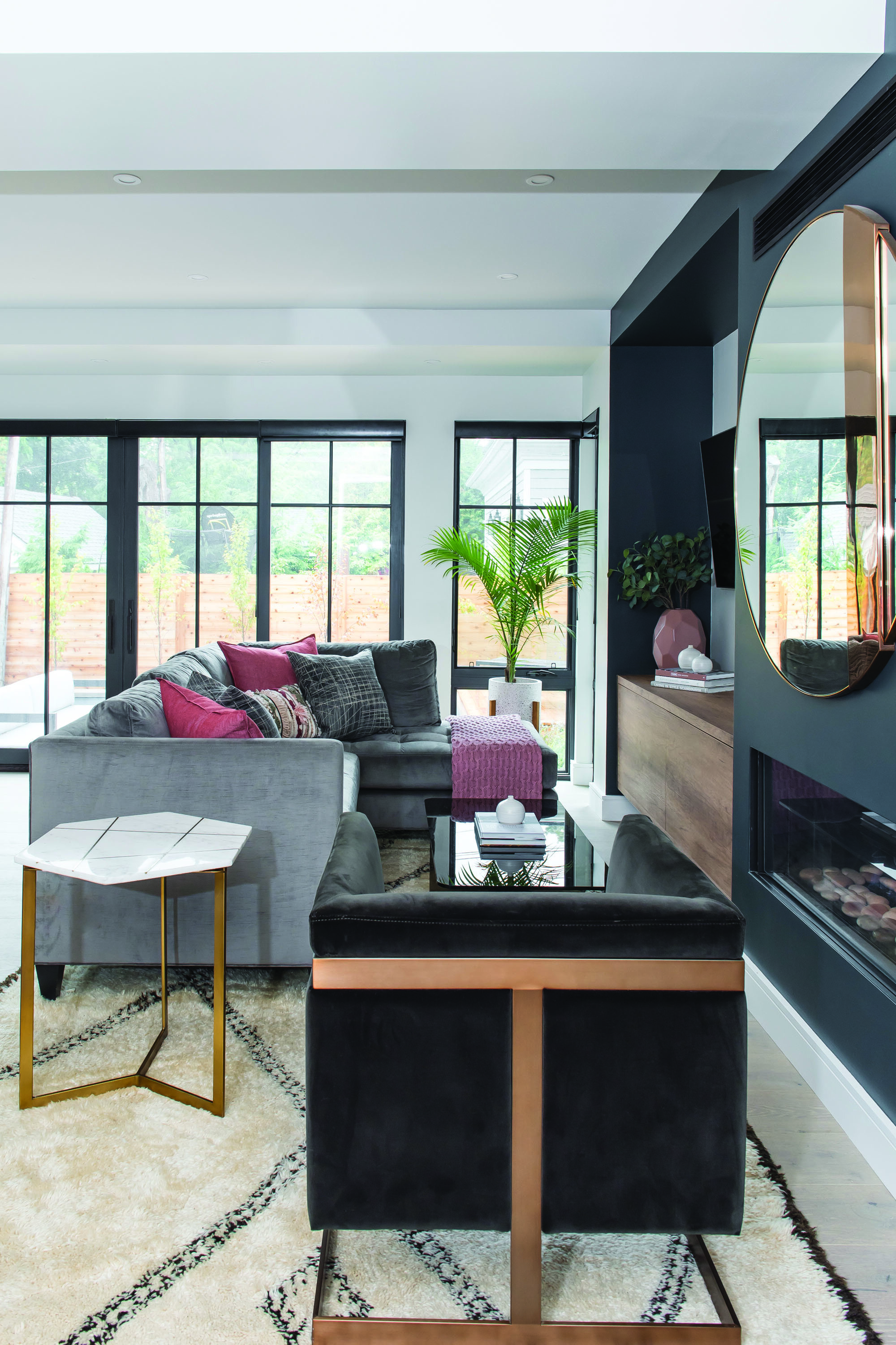
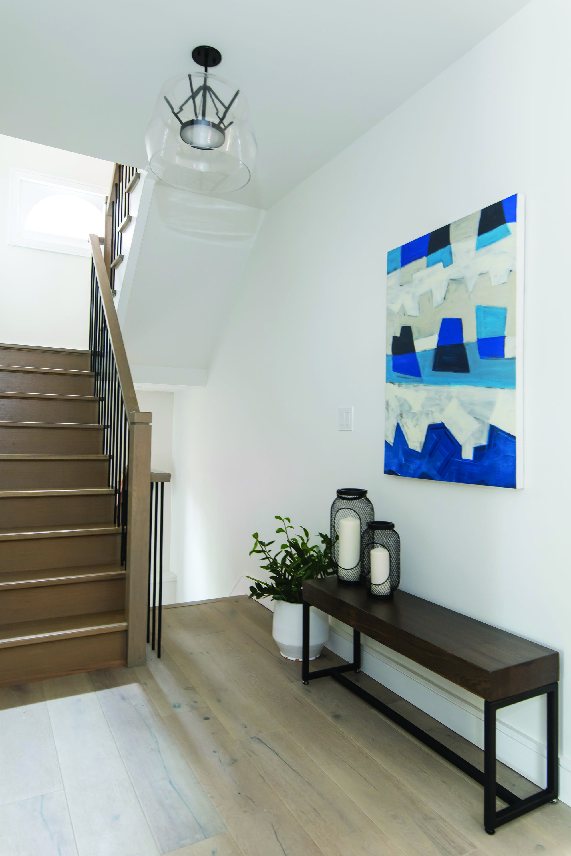
The main floor includes a bright foyer, open-concept living space, kitchen, powder room and office. Hay’s Woodworking Group Ltd. (Mississauga) built the custom cabinetry throughout the home, including in the laundry room, all bathrooms, the built-ins, the entertainment unit, a bar and all kitchen cabinetry. In the kitchen, dark cobalt blue carries to the fireplace feature wall and contrasts nicely with the use of white.
“There’s an inlay of rose gold on the base cabinetry, and the kitchen faucet and fridge door handles are also rose gold, as is the mirror above the fireplace,” says Anita. “With metal finishes, you have to do just subtle hints of it. You must show restraint. Less is more.”
The powder room is another standout. “It’s this very tiny space with a beautiful palm leaf wallpaper and it’s finished with the rose gold fixtures. It’s just stunning,” says Anita. A floating wood vanity balances the look and adds warmth to the space. “I like to have wood elements in that kind of high contrast, because it just softens everything,” says Anita.
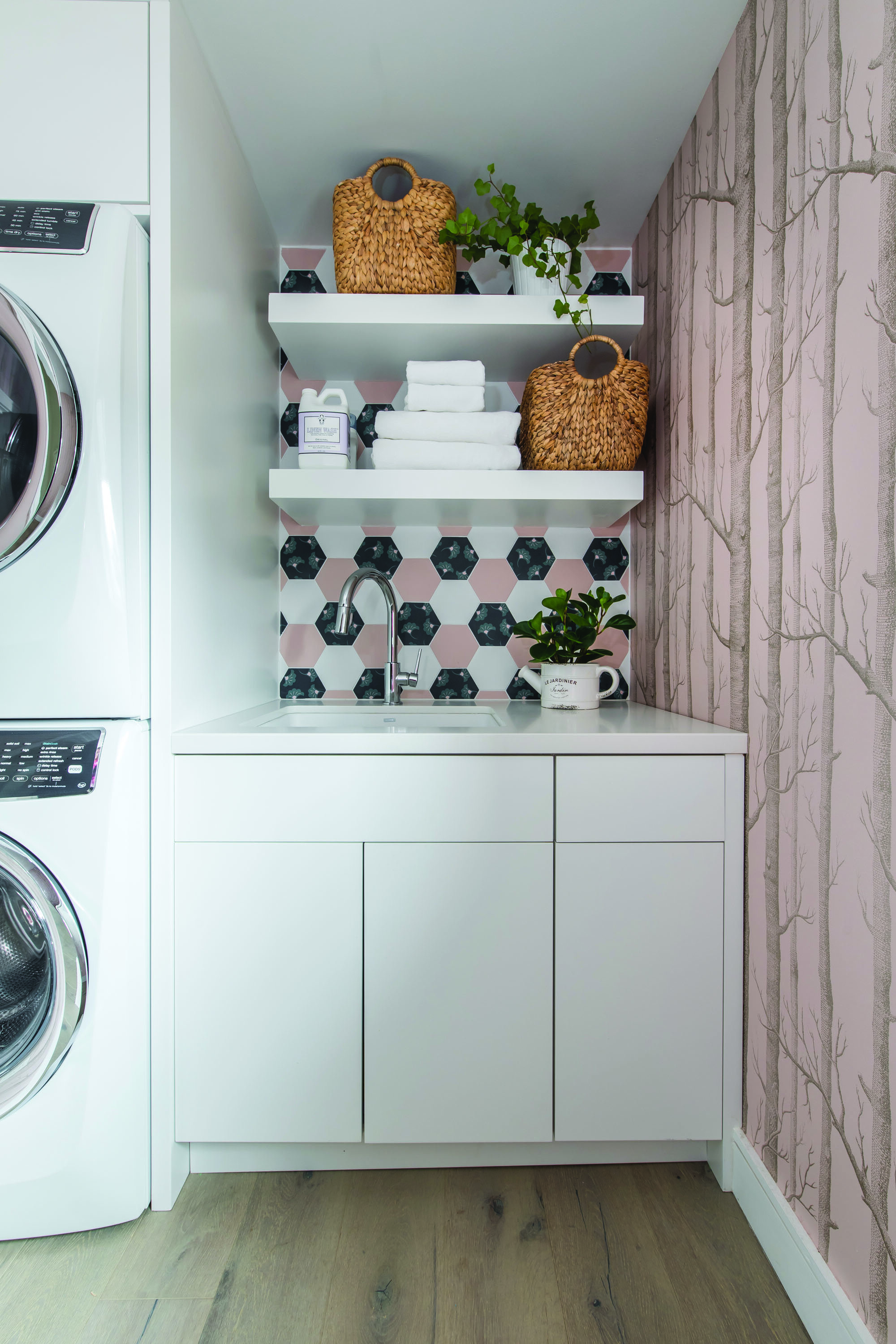
The new second floor configuration contains the kids’ rooms, a second office, bathroom and laundry room take up residence. “The laundry room is one of my favourite rooms. It has open shelving that exposes a fun hexagon wall tile done in blush pink, black and white,” says Anita. “The remaining walls are done with an enchanted forest-themed wallpaper in the same blush pink. It’s very whimsical but fresh with all the white cabinetry.”
The black-and-white carries to the second bathroom with a chevron tile backsplash, white vanity and black and white geometric floor tile. Crowning the house is the new master bedroom and en suite, which offers privacy and makes use of the attic space.
The revival of this century-old home doesn’t end inside. Aric’s team also redid the landscaping. “We did a full exterior landscape, a plunge pool, a deck, shed, front landscaping, driveway and fencing,” Aric says. “I love the plunge pool in the back,” says Sarah. “We have such a small backyard and it just adds something more for when we have kids over and it’s more for them to enjoy.”
Though the interior is new, the exterior maintains many of its original features. “I wanted a much more modern interior, but we left the house on the outside more traditional, and it worked,” says Sarah. “It was well done in keeping with the architecture of the neighbouring homes. We tried to maintain the brick and other details on the house to keep with the character of the area,” adds Aric.
In a neighbourhood that offers it all, now the family’s house does too. “In the end, I’m glad we didn’t tear the house down,” says Sarah. “I was thrilled when we moved in. It’s like a brand new home. Digging down the basement gave us a whole other space to hang out as a family, and now finally we can eat together in the kitchen. I’m so happy we stayed.” OH


