Demolished To Polished
Story Merrilyn Patterson | Photography Jason Hartog | Flowers Blooms + Flora
Sarah McBean and Svein Piene purposely searched for an old house in a state of ill repair, but located in a desirable Guelph neighbourhood. Two years ago they found exactly what they sought – on a beautiful ravine lot, close to downtown, river trails and with young families close by. And it certainly needed a lot of work.
The two-storey brick house with third-floor loft, built in 1910, boasted a dark interior and compartmentalized small rooms. The vision from the start was to open up the main floor, make the best use of space and create a family home with an inviting aesthetic.
Sarah and Svein, owners of Rug & Weave, interviewed several builders, searching for a perfect fit and an understanding of the vision they had for their home. The couple bonded instantly with Pat Livingstone from PDL Contracting Inc. (who left his business card in their mailbox) and hired him as lead contractor on the extensive renovation project that spanned four months of late 2018.
The entire main floor of the house was gutted. Pat and his team removed all the interior walls, making way for a large beam to support the floors above. Sarah, expecting the couple’s second child, relocated to her parents’ home in Windsor along with their first son, Finn, while Svein toughed it out in the third-floor attic.
“That time was very hard – I was separated from my family, managing the business, and it was cold and hard to live in the house,” he recalls.
With the demolition complete, Sarah’s cousin, Chris Rennie, a brick mason, cut into the exterior brick to create a window in the kitchen and a passageway from the foyer into the main living space. New patio doors were also installed that would eventually walk-out to a 500 sq. ft. deck overlooking the ravine.
The existing porch, previously added to the house, was removed, and a large entryway was designed with ample storage. A handy bench makes it easy to pull on boots and there’s a pretty and convenient powder room nearby.
Both Sarah and Svein have a minimalist approach, and are most comfortable when everything has a place. The open-concept kitchen/dining space was designed with this need in mind, featuring deep pot drawers and large cabinets with ample storage for serving dishes and small appliances. The busy parents like to prepare meals together, and their large island offers ample space for both cooks. Counters are topped with Caesarstone Statuario Nuvo quartz from KW Countertop.
The couple designed the kitchen themselves, then ordered through Ikea. Sarah remarks, “It was super-simple once we narrowed down our layout.” The kitchen boxes are Ikea-built, but the door fronts are sourced from Semihandmade, which makes custom doors to fit Ikea boxes. Ikea calculated the size and the number of doors and drawers that would be required to complete the design. Sarah had the doors spray-painted with Farrow & Ball Studio Green and finished with brass knobs and pulls sourced from Lee Valley.
The living room is a relaxing spot for open conversation when company arrives. Sarah designed built-in shelving on either side of the existing fireplace and a white oak mantel to modernize the original brick facade. All of this work was done by a local craftsman from Tupelo Furniture Design.
The cosy space is warmed with accent rugs and handmade pillows from their store, Rug & Weave. “Some of the rugs in the house get switched out sometimes, depending on the season, but this one in the living room is a favourite,” says Svein. “It anchors the colour scheme on the main floor where blues and greens play off the neutral tones from natural elements in the room: the wood floors, green plants and handcrafted woven basketry.”
Sarah’s talent for design and whimsy is particularly evident in the boys’ rooms. For Finn, she and Svein wanted white with pops of colour, with a nod to Scandinavian design (Svein is of Nordic roots). She added playful decorative items to his walls – little wooden house shelves, Finn’s own framed art and his favourite animal paintings. The dresser is a Mid-century modern vintage piece they thrifted and refinished themselves.
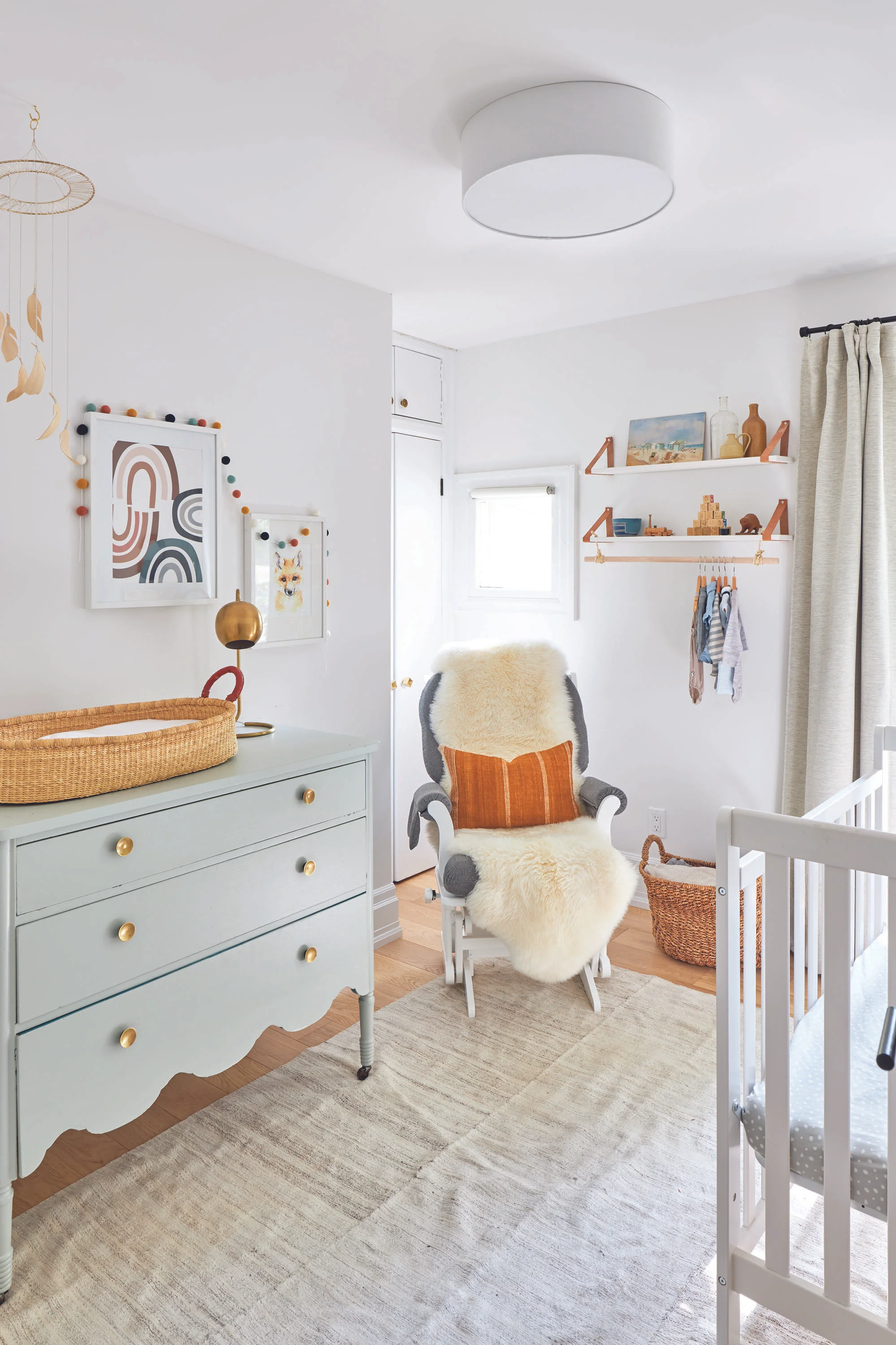
Sully’s nursery is a calm space with light colour tones and vintage decorative items throughout. They found the vintage seascape oil painting in Belgium. The Noah’s ark wall hanging, bottles, blocks and wooden toys on the shelves are all vintage finds.
The attic had already been renovated when the couple moved in, but they have definitely put their stamp on it. It’s where the family goes to watch television. It’s a child’s paradise, with chalk-painted walls, polka dots on the wall and ceilings, plush animals and toys everywhere. It’s also out of sight, so the rest of the house stays relatively free of clutter.
Sarah reflects on the reno. “I love our home, and all of the work we put into getting it to this point was so worth it,” she says. “Svein jokes that we will probably move on to another home project one day, but I like to think this is where our boys will grow up and so many memories along the way will be made.” OH


