Still the One: A Family Home Transformed
Story: Gina Makkar | Photography: Jason Hartog
What happens when homeowners, a talented designer and an innovative builder team up to transform an older home into a modern family retreat? It’s serendipity.
With their kids grown, Connie and Dave Wootten were ready for a change. “We were going to move to a smaller house on a bigger lot in downtown Burlington, but we couldn’t find anything,” says Connie. Instead, they decided to renovate, and enlisted the help of Designer Mary Cath Altobelli of Alto Interiors and Rob and Todd VanderBrugghen of Ridgeline Renovations Inc.
“Every time I get an opportunity to work with Rob, I take it,” says Mary Cath. His workmanship is exceptional. He really takes pride in his work. He sees what I speak. It’s like he already has the vision of the end project.”
Hiring a designer to help reinvent your space shouldn’t feel like a leap of faith if you’ve teamed up with someone who gets you, and Mary Cath can walk into a space and see its potential. She presented the couple with option A and option B, the latter a complete overhaul to maximize unused space and update the main floor.
From there, the team spent several months planning, a step Mary Cath says is paramount. “It’s where you hash out ideas and get to know a client and find out what works for them,” she says. “They have a vision, but you want to enhance the vision with a decorator’s perspective. It’s their space, and it needs to be connected to them. I know when I have done a good job when they can’t tell a decorator has been there.”
The home’s original footprint included a fireplace that separated the main floor. Ridgeline relocated it to the back wall, and it now blends seamlessly into the aesthetic. “They travel extensively and want to come home and unplug,” Mary Cath says of the owner. Now, the fireplace is the first thing they see when they walk through the door, and it can be enjoyed from anywhere on the main floor,” says Mary Cath. Floor-to-ceiling stone creates a dramatic focal point. The stone mason laid out each and every stone and Connie and Dave helped choose each piece. An extended hearth adds depth and creates a cosy nook under the window.
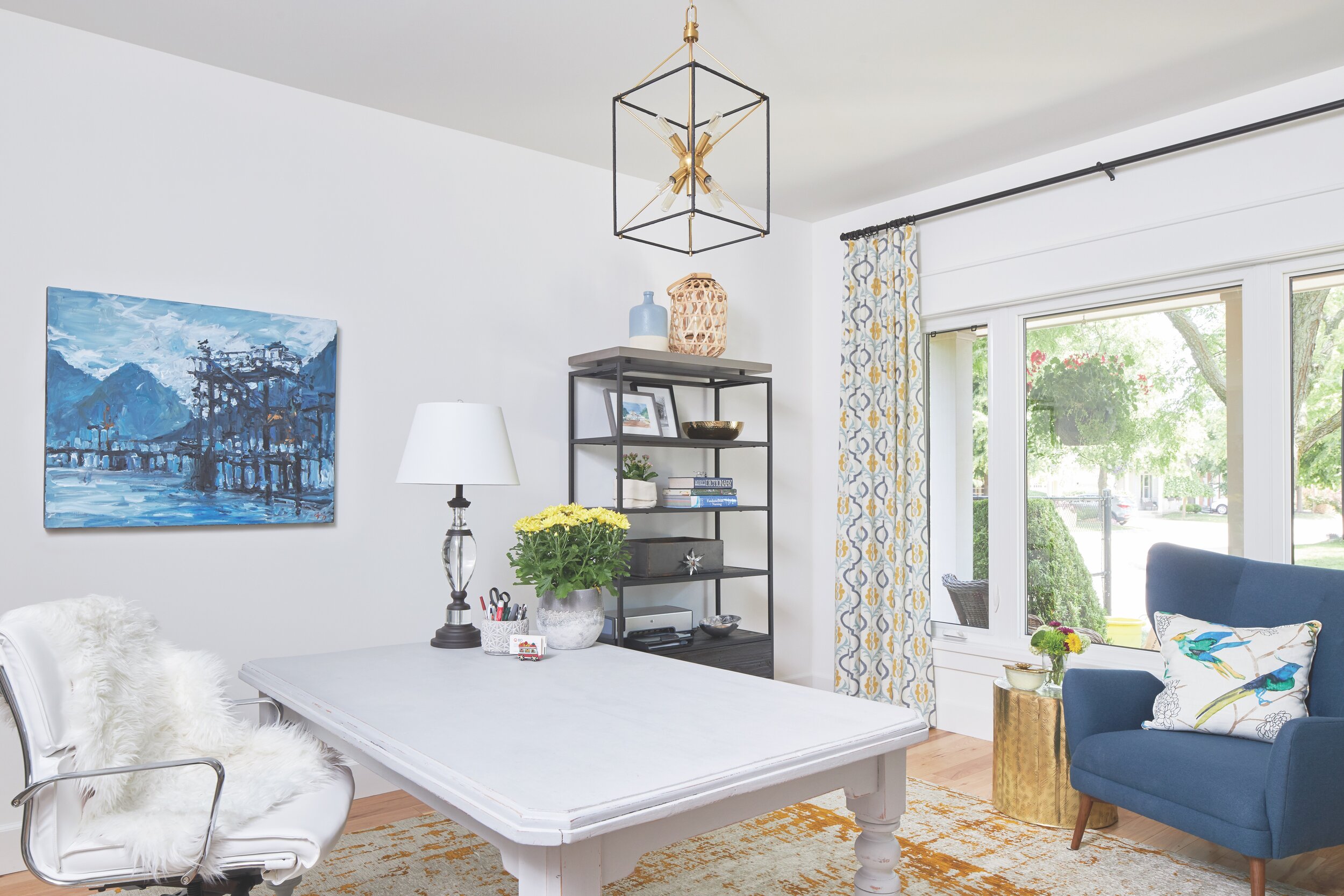
An area at the front of the home, traditionally slated as a dining room, was transformed into an office for Connie. “I was very persuasive about it having doors,” says Mary Cath. An oversize sliding barn door adds dimension and opens to the entry way. “Rob came in and made the magic happen and sourced the door.”
A harvest table sourced by Mary Cath from Zoey's Consignment was refinished by House and Canvas. A shelving unit, desk chair and lounge chair from In House complete the space.
Glass french doors open between the office area and the main living space. “In the future, they can use the space as a dining room. There’s a lovely chandelier in there, it gives so much energy, and it gives them options for today and options for the future. It’s just limitless.”
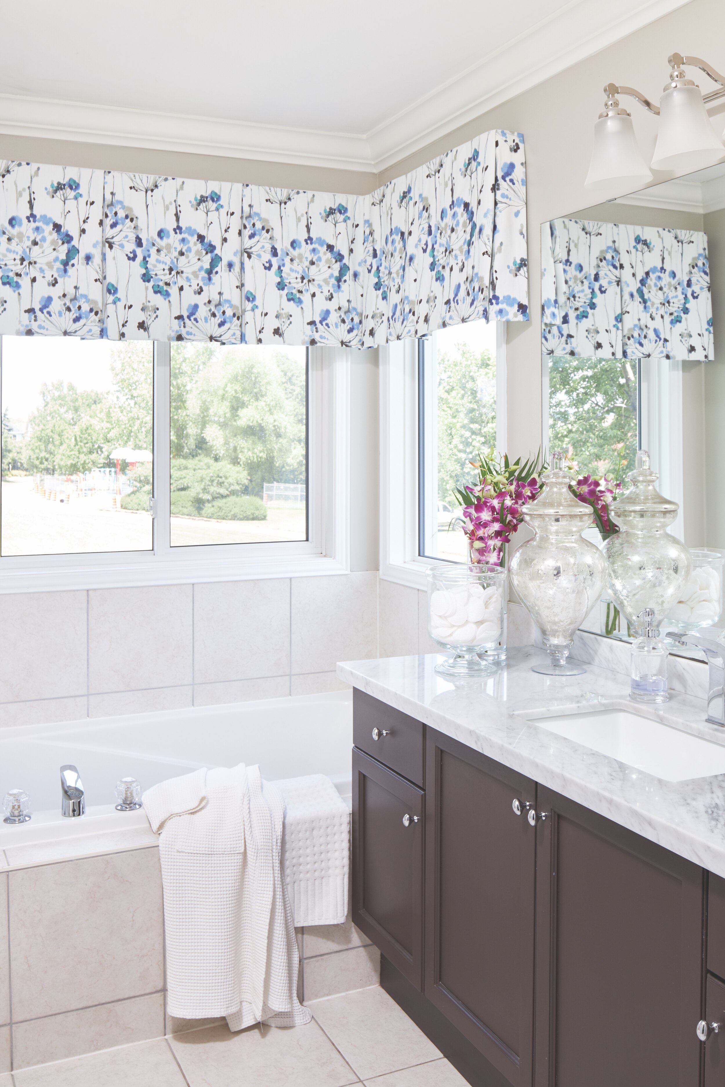
The furniture, fabrics and rugs were sourced by Mary Cath through The Decorating Centre, and window coverings were custom-made by Gotcha Covered Escarpment.
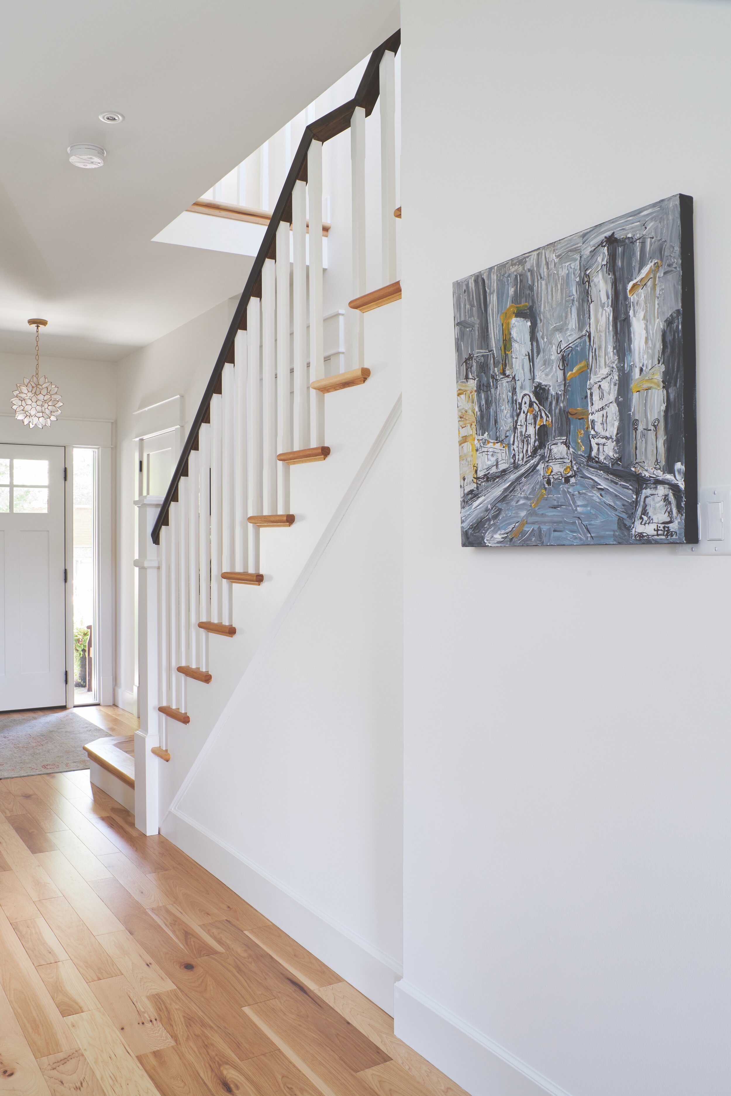
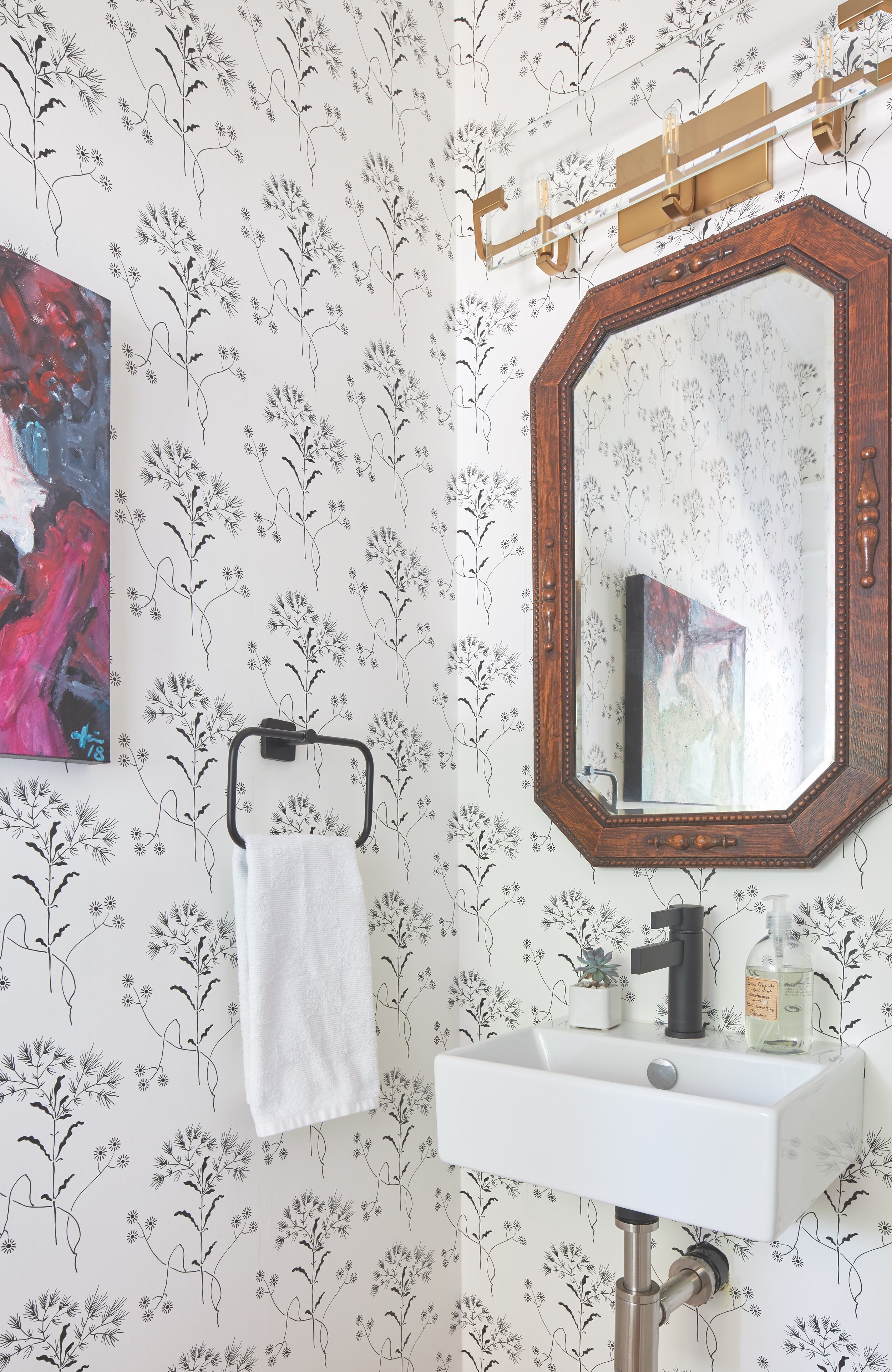
In the living room, an antique table and chairs behind the sofa were recovered. “It gave them a whole new life, and they relate to the new textures and colours in the space and come in handy,” says Mary Cath. Original artwork in the office, entry hall, powder room and kitchen by artist Marina Randazzo add colour and texture to the space. “Whenever you have original art, it adds so much depth to the space.” The piece in the powder room, titled Primp was a piece brought in for the Junior League Holiday Home Tour a few years ago,“ explains Mary Cath. “Connie liked it so much that Marina did an addition to that series, so the art was customized for Connie. It’s a little wink in the powder room.”
Lighting, says Mary Cath, elevates a space like no other feature. “Once you put in some personality lighting it’s a whole other space,” she says. Fixtures sourced from Gerrie Electricinclude a chandelier in the family room, pendant light over the kitchen peninsula and an accent light over the charging station, which is a fun yet functional custom addition. “The house is still the original, but it feels so much larger now because these little moments catch your eye.”
In planning, they considered furniture arrangement and added a floor receptacle to create an easy path to plug in a lamp or seasonal accent when needed.
In the kitchen, the cabinets were refinished by Silverbirch Woodworks. Glass cabinets were removed in favour of open shelving and a Scandinavian-inspired tile statement wall. “It just adds so much personality. It’s texture and light, and removing the cabinetry allowed the light to flow.”
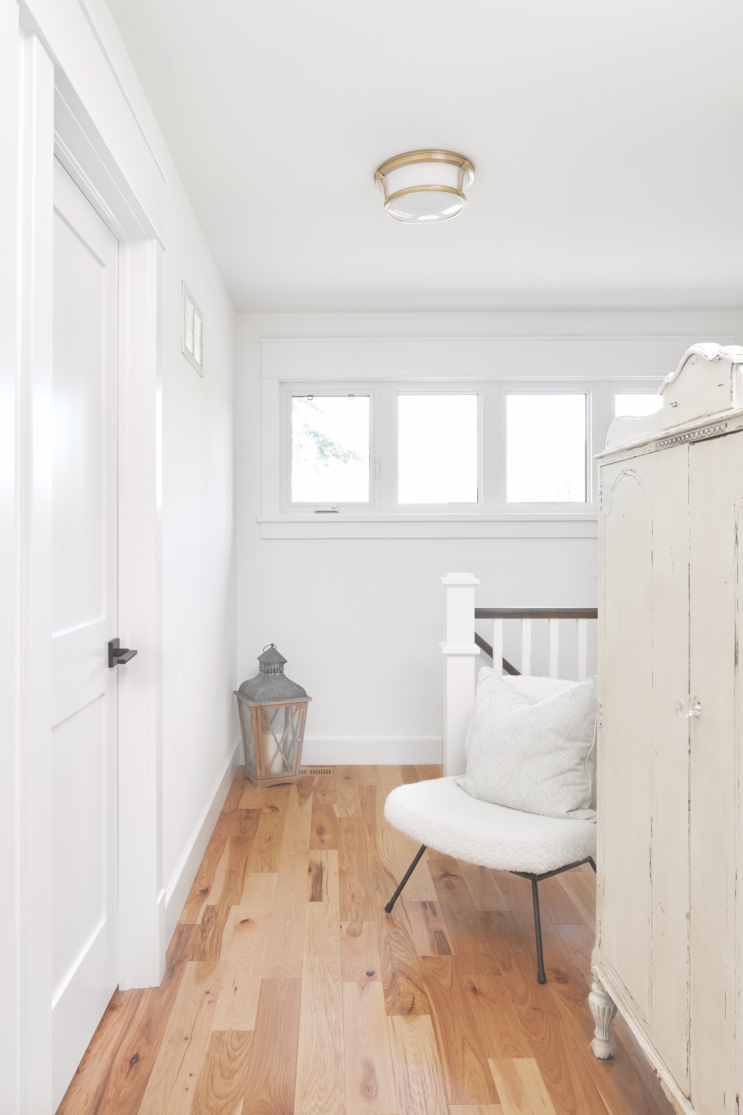
In the upper level, a built-in desk on the landing was removed to open up the space. An antique cabinet from House and Canvas adds whimsy.
From top to bottom, the design and renovation team made the most of the space, allowing the finer features to stand out and create a style that’s beautiful, functional and feels like home.


