Plenty of room
STORY DENISE O’CONNELL
PHOTOGRAPHY LARRY ARNAL
For avid cooks and seasoned hosts, the kitchen is the centre of daily life and a space where both beauty and function are important. Bright white and moodier hues create a dynamic backdrop.
Trish and Louis had been steadily working, bit by bit, on their two-storey home north of Toronto. An earlier basement and bathroom renovation set the stage for style and increased space for guests and entertaining. But it was during the pandemic that the couple anticipated gathering again with their large family, enjoying good food and each other’s company.
“The main floor was the final piece that needed to be done,” says Trish. “We started thinking about the kitchen and the laundry room, but then as we started talking, we realized it made sense to tackle the whole main floor. We wanted a home where it felt comfortable to host 25-30 people at one time.”
They called Jackie Venneri of Style It With Jackie, who had worked with the couple on previous renovations. They love Jackie’s style, the way she works and her willingness to take risks.
Designer Jackie Venneri of Style It With Jackie
“Trish and Louis approached me with the inspiration to have better flow in their original and dated kitchen,” recalls Jackie. “They were also looking for something bright, but a room that also had some drama and moodiness.”
The kitchen was surrounded by original cabinetry in a dated almond with brown speckled granite. A peninsula jutted out from the wall offering casual eating space but obscuring the flow of the room.
The common gap left above the builder’s cabinetry was replaced by dramatic black custom floor-to-ceiling woodwork by Tamiron Contracting and Millwork Limited, the contractor for the project. A built-in Sub-Zero fridge and wine fridge from KWA Appliances provide a seamless look. White fixtures, a feature wall with a white range hood, white cabinetry and clean white quartz countertops by Continental Marble and Granite Co. Ltd. complement the black cabinets and expansive island. To break up the monotone look, Jackie placed warm brown leather chairs around the island. Warm gold hardware from Handle This! enhances the look.
The island was designed with gathering in mind. The size and position create better flow.
“One thing I originally wasn’t sure about was the size of the island,” says Trish. “I worried it would make the room feel crowded. Jackie convinced me that the kitchen has the space for it, and it would really make it the gathering space that I wanted. She was exactly right.”
The floor is matte hardwood by Project Hardwood laid in a herringbone pattern for geometric interest. “Some people are worried about hardwood in a kitchen,” says Jackie. “But hardwood is a very durable, resilient surface and handles day-to-day use very well. It is also a softer surface, making it easier to stand on for long periods of time.”
A custom floor-to-ceiling built-in bar area connects the elements in the kitchen and provides more storage.
Some contemplation went into opening the space by removing a wall that housed a built-in servery. Jackie and the couple decided against it and instead designed a beautiful and functional bar area.
The dining nook is carved out of a corner in the kitchen, complete with a comfortable banquette to maximize space.
The light wood kitchen table is flanked by a custom banquette by Morra Custom Upholstery and modern black dining chairs by Rove Concepts. Black window casings by Renoasis make a huge impact. “The kitchen is now intuitive,” says Trish. “Everything down to the space where I keep my cookie sheets is well-planned and built into the space.”
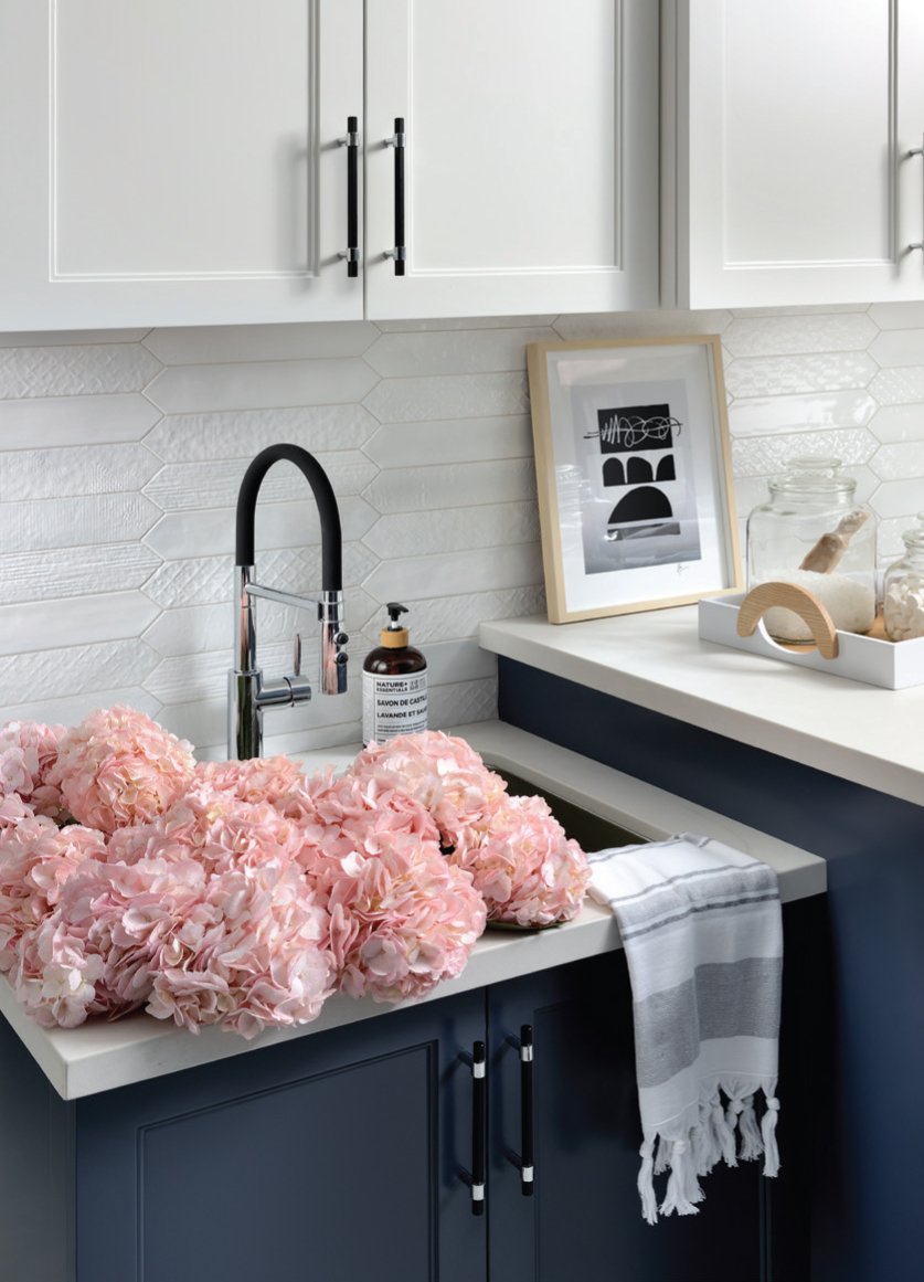
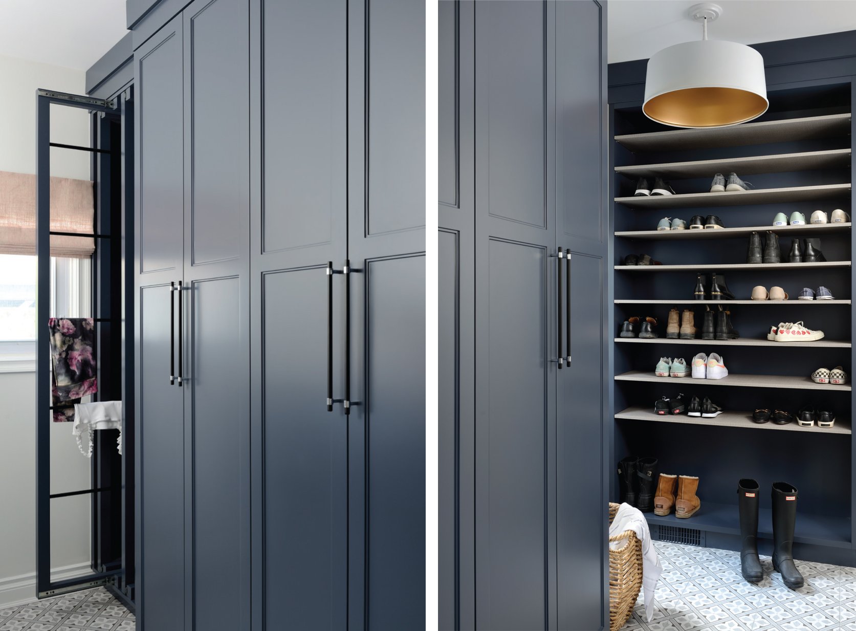
Trish wishes she had the new laundry room when the kids were little. Now that the kids are older, there is finally a spot for muddy boots, wet clothes and lots of space to tuck away clutter. Here, Jackie opted for navy blue floor-to-ceiling cabinetry, but what they love most are the drying racks that tuck inside. Pull them out, hang out the wet laundry and easily fold them away for next time. A full wall of shelving accommodates over 50 pairs of shoes, including tall boots, something Trish admits was her husband’s idea. The floor tiles by Tiles Inspired add interest and pull the colours together.
This laundry room/mudroom combo is organized and efficient and beautifully decorated. It integrates floor-to-ceiling cabinets to tuck shoes out of sight. Laundry racks are cleverly hidden and neatly folded away when not in use.
Jackie wanted to create a living room that didn’t feel too formal. Trish walked into Gray House and Co. and saw a pair of chairs that spoke to her. “I had to have those chairs,” remembers Trish. “Jackie took those chairs and designed the living room around them.” Beautiful ecru with a blue floral pattern became the springboard for a modern yet natural style. The showpiece is a gas fireplace with a new quartz surround. The seating is plentiful with a comfy sofa, black accent chairs and leather ottomans that double as stools. “We love that this room doesn’t feel so matching,” says Trish, “yet it still flows.”
Jackie says working with patterns in a space can feel intimidating, but she assures us that it can be done. “Florals can be mixed with geometrics, muted patterns and bolds can work together to create magic,” she says.
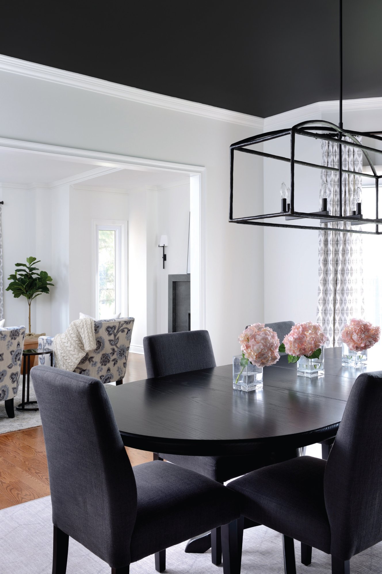
The dining room makes a bold statement with white walls and a black ceiling. It’s the perfect backdrop under the glow of soft-lit nights.
In the dining room, Jackie made a bold choice with white walls and a black ceiling. The couple wasn’t sure but trusted Jackie.
“Jackie reminded us that it’s just paint,” says Trish. “You can play around with paint colour, and it’s easily fixable if it doesn’t do what you want it to.”
With children who are almost grown, Trish and Louis are at the point in their lives when many couples start to think about downsizing in the future. With their new space, they say that will be the furthest from their minds as they hope to continue to share their home and make it the centre of family gatherings. OH
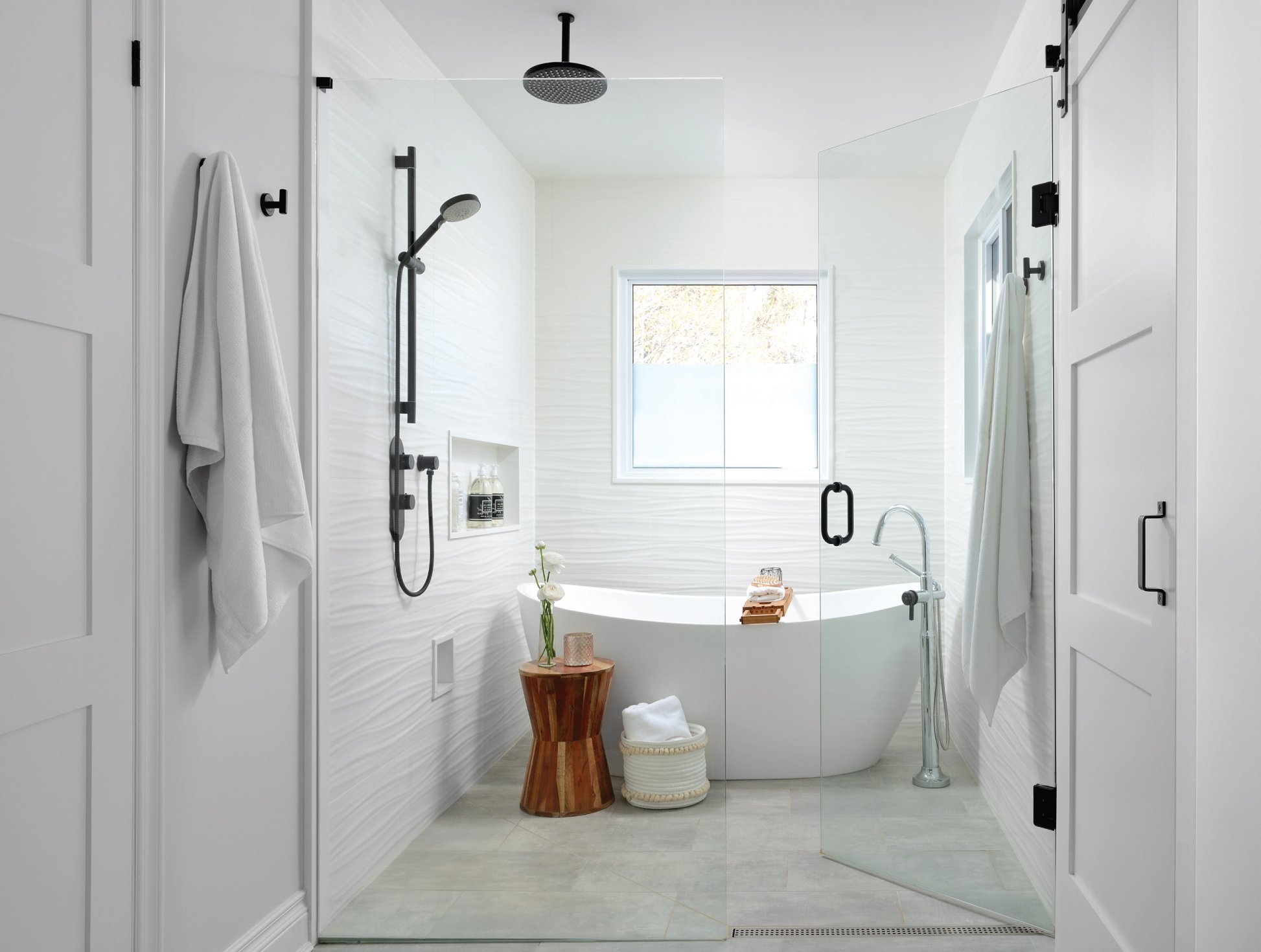
The primary en suite is both energizing and relaxing. A luxe wetroom encloses the freestanding tub and shower area and adds a spa-like feel. A barn door slides closed to hide the water closet, and the vanity strategically makes full use of the corner space.


