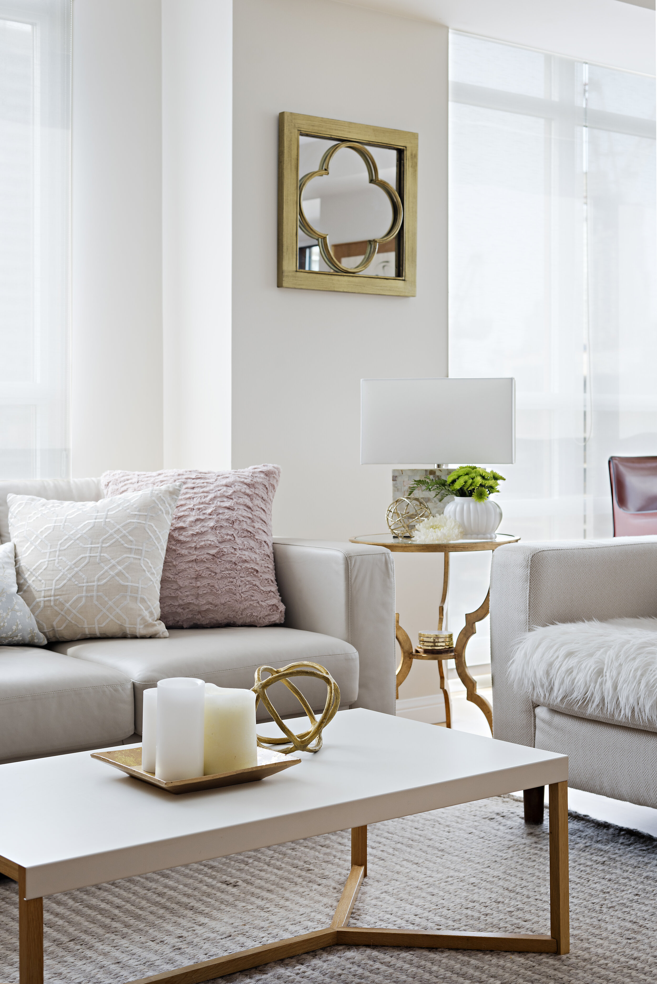
Lighten Up: White, Bright & Beautiful
STORY ANDREA COLMAN
I just love the look of white on white, and I'm not alone. The bright, refreshing appeal of a white-based colour palette has been a long-standing trend, and it's little wonder why. From living rooms to kitchens and bathrooms, across a vast range of styles, it will always be a popular choice.
Now, there's a right way and a wrong way to work with white. Here's why I love this choice, and how I like to use it when designing a space.
1. Timeless Beauty
Some trends come and go - and trust me, when they go, it's painfully obvious. (Remember your Grandma's avocado-coloured appliances and shag carpet?) Some finishes will instantly date your home. White, on the other hand, has no expiry date. Because white is the ultimate in neutrals, it's easy to update with new accessories in trendy colours, patterns and metallic finishes. This is a quick and inexpensive fix when your home feels like it's suffering from a "style slump." The timeless appeal of white is perfect for items that are expensive or difficult to change, such as tiles, walls and big-ticket furniture items.
TIP: Don't feel like you have to shy away from white upholstery. Of course, if you have young children or pets in the home, a white sofa might not be the most practical choice. With that said, fabrics come in a range of washable and fibre guard practical options that will have stand the test of time - and sticky fingers.
2. Wide Appeal
It's hard to offend with white. Other colours, such as yellow, red or virtually any hue, have the potential to be an affront to some. And the bolder you go, the greater the risk. Don't get me wrong - I love designing with colour. But for someone who may be hesitant to commit to a vibrant hue, or when there are vastly opposing opinions in the home, white is typically an easy win that still makes a big impact.
3. Selecting The Right White
Before you choose "white" and move on to your next design decision, know that white comes in hundreds of different colours. What the what?? That's right - every colour in the rainbow comes in its own version of white. Yellow, blue, pink and green tints make every white appear different. Pure White, China White, Antique White, Bone White... when compared side by side, it's easy to see how different they can be. Layering different tones of whites within a space can be a great strategy to warm up your palette and bring depth to the overall design. Just be sure your whites complement one another. Reminder to pay attention to the kind of natural lighting in the space as this will also change the overall perceived brightness of the white.
As a designer, white is one of my all-time favourite colour choices - despite the fact that it's not technically a colour at all! White has been trending for some time, and it's not going anywhere anytime soon. Contrary to popular belief, white can be an exciting choice for your interiors, when it's done right.
Andrea Colman is Principal of Fine Finishes Design Inc. With almost two decades of reno & design experience, her full service firm services clientele throughout the GTA and Ontario. The growing boutique design firm is known for creating stylish, harmonious, livable environments.
Visit www.finefinishes.ca for more information.


