Home Improvement
STORY TIFFANY MAYER | PHOTOGRAPHY KELLY HORKOFF
Every artist has that one canvas. Every writer has that one byeline.
For Ian Root of Carlian Contracting, it’s that one renovation – an overhaul of a Fonthill bungalow that turned it from passé to timeless in four short months.
“Right from the curb, I get excited seeing the house,” Ian says. “Every single detail – I’m almost giddy when I walk through the house. It’s cohesive and everything comes together. It’s not just a house with a really nice kitchen. It’s a really nice house.”
It wasn’t always like that, though. When Ian first pulled up to the curb in late 2018 to meet with the homeowners, he saw a dated exterior with a portico that designers Margot Bell and Dasha Ricci from Peaks & Rafters dubbed “the bad tie.”
Things didn’t get better when Ian saw the bad tie from the inside. The peaked roof of the portico stretched into the foyer, a box with soaring, 14-foot ceilings, while the rest of the home had the standard nine-foot versions. “You felt like you were in a tunnel,” he says. “It felt weirdly uncomfortable and disconnected from the rest of the inside.”
But what he also found inside were homeowners keen to make changes. They wanted something clean and contemporary with a Mid-century vibe. They had experience in major home makeovers, and their tastes were specific and their standards high.
Hiring Ian was a perfect match. “When they asked for more, we ate it up because it was just so cool,” Ian says. “It was really easy to get going. There wasn’t a lot of hand-holding.” And no handwringing about the changes to come, starting with removing several walls to open the main floor. That included moving the laundry room to the lower level, taking down a double hallway to a television room behind the garage and converting an awkward exit in the TV room to a window from Crowland Sash & Frame.
“It was just cobbled together and had been renovated several times since it was built in 1996,” Ian says. “We pulled it all apart and rebuilt the space. It’s had a lot of lives.”
European white oak flooring from Moncer Specialty Flooring was used to create a feature wall behind the television. To keep the look flawless, Ian’s team used the same white oak floor boards to fashion a custom shelf to hide television cords and components.
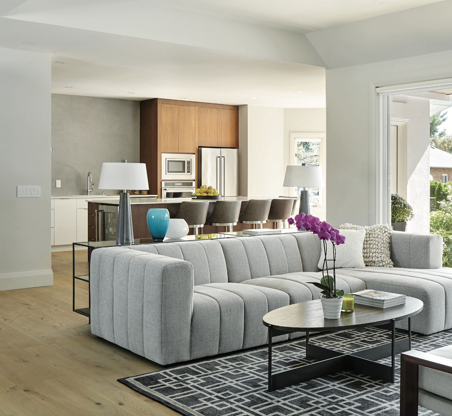
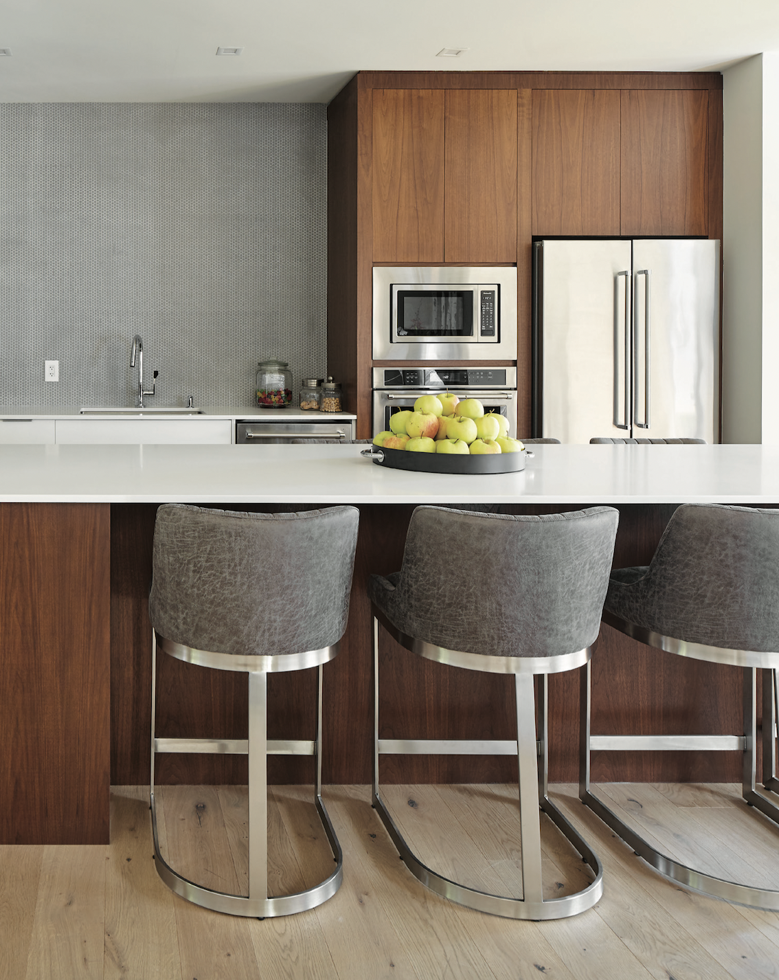
In the kitchen, dated raised-panel cabinetry was replaced with high- gloss, smooth white doors with walnut and chrome accents from California Kitchens and Baths. A massive 11-foot island was added to create more work space and additional seating. Ian closed off a window over the galley, equipped with stainless steel appliances from Nickerson Appliances to create a large backsplash covered in grey matte tile from Dimensions Floor Fashions. Chrome built-ins, a walnut pantry and a wall for art were also added. The space is now more efficient, user-friendly and of the moment.
French doors to the great room were removed to connect the main- floor living spaces. Another wall was opened up to accommodate a massive glass slider that provides a view to the private backyard and seamless indoor- outdoor living in summer.
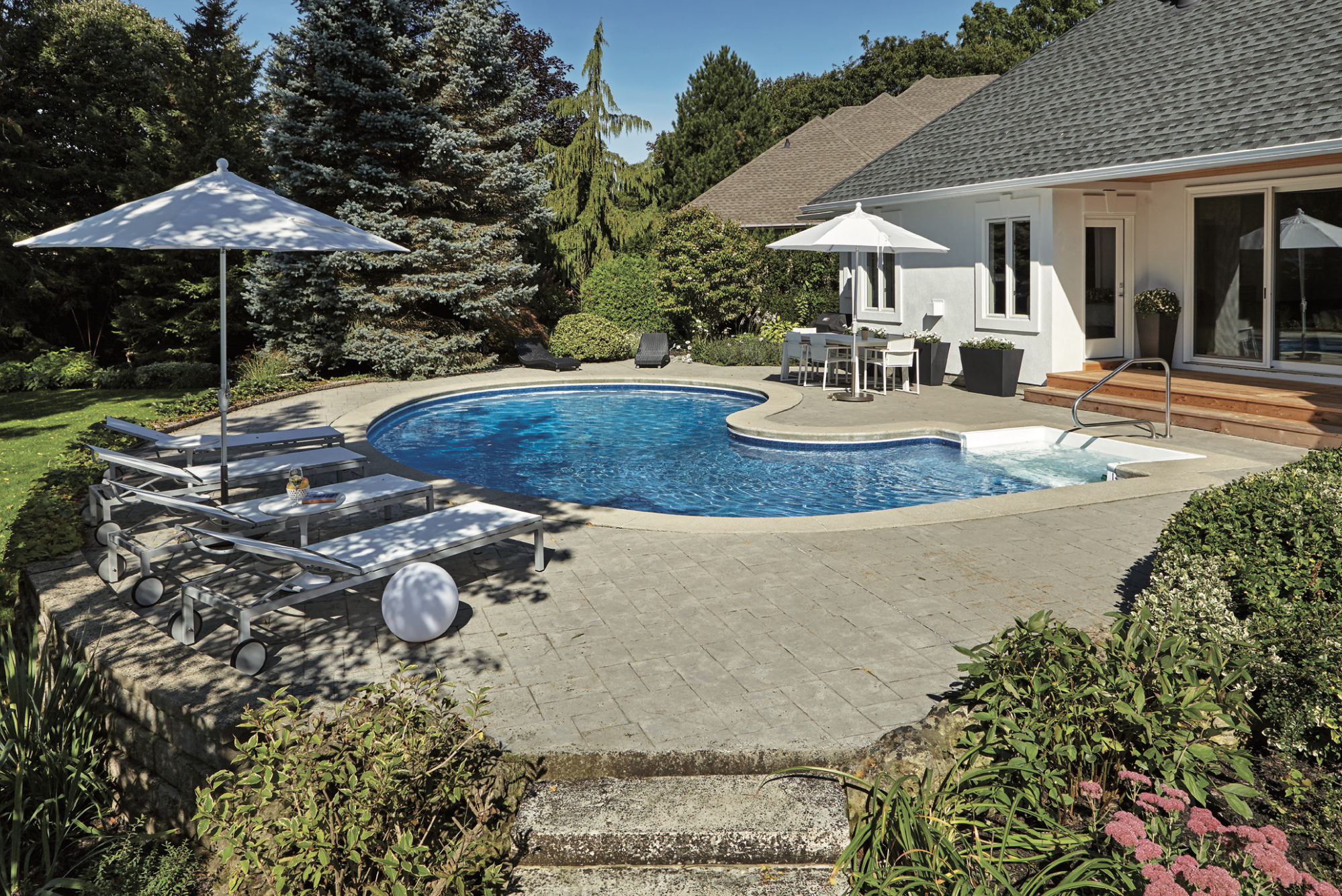
The old stamped-concrete back porch, partially covered with pressure-treated lumber, was replaced with clean and classic cedar decking. The covered part of the patio was refinished with tongue- and-groove cedar to connect top and bottom while pot lights similar to those indoors tied inside to out.
At the front of the home, gables with round windows over the garage were removed, cleaning up the lines of the simple hip roof.
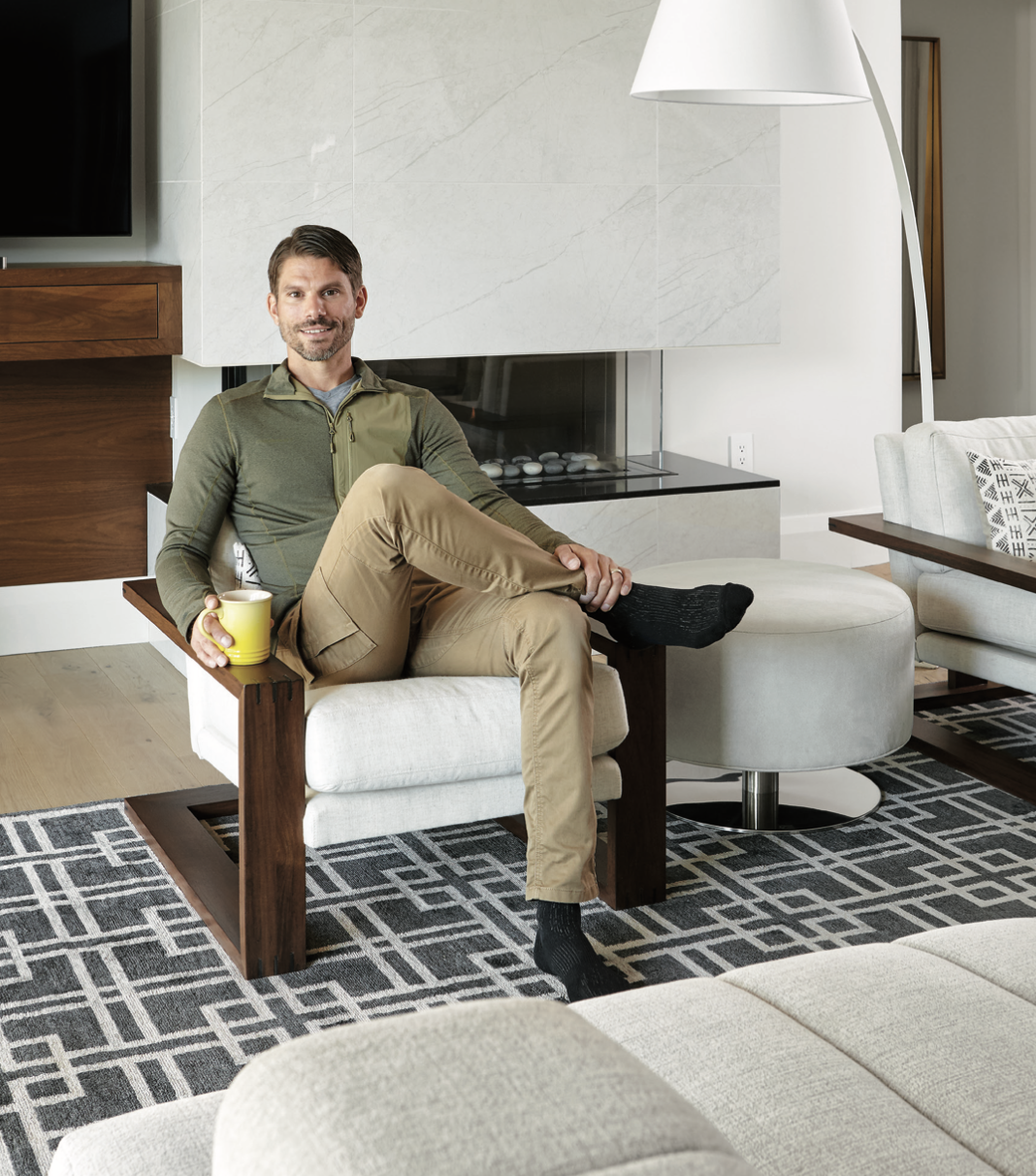
Back inside the great room, tired built-ins around the mantel were taken back to the studs to make room for a new, three-sided fireplace from The One Stop Fireplace Shop. Ian’s team built another custom television shelf out of walnut to match the kitchen cabinetry and hide wiring. Crown mouldings were also purged. An art deco wall that wrapped around the corner to the master bedroom was spared to maintain an open-concept feel. The entire space was painted Benjamin Moore Simply White from Fonthill Paint & Decorating.
“If we squared the art deco wall off, it would have made the hallway to the bedrooms kind of cave-y,” Ian says. “It became a nice detail almost in spite of itself.”
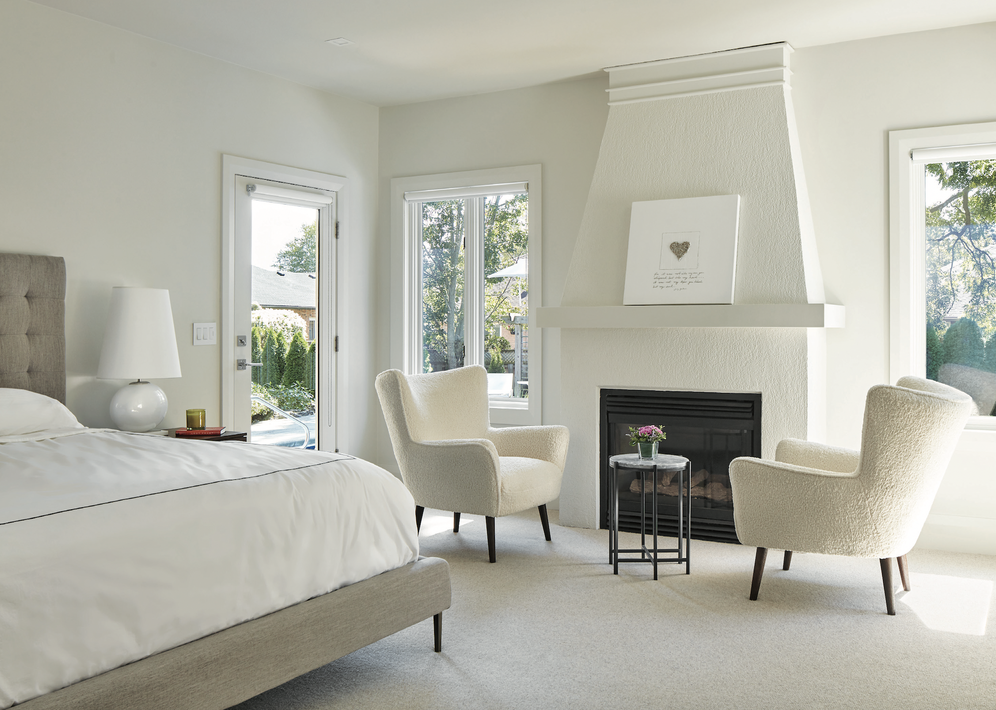
The master bedroom was rejigged to remove a clear view from the bed into the en suite. Ian also borrowed space from the walk-in closet to enlarge the bathroom, then created a second reach- in closet for his-and-her storage.
Much like the art deco wall, conversations ensued about the glass block window in the en suite, but it was kept for the light it provides and the moment the style is enjoying again.
The real feat, however, is the shower floor, covered with 720 two-inch square tiles cut with a water jet from the two-by-four plank tiles used in the rest of the en suite. “It was another situation where they wanted the floor to match and I just wanted to find a solution,” Ian says. “I just did the extra work to make it really cool.”
All plumbing, along with heating and cooling in the home, was by Konkle Plumbing & Heating.
Then there’s the portico that first greeted Ian. It came down, the ceilings were lowered and the doors closing off the foyer from the rest of the house were removed. The new entryway was painted Ink Black to contrast with the Simply White everywhere else. A large walnut front door from Niagara Pre-Hung Doors now greets visitors instead.
All of it has left a lasting impression on Ian and his team in the best possible way.
“When they’d say, ‘We want this,’ we’d stay late and finish because it was just so gratifying,” he says. “When it’s a great relationship like that, it’s so exciting to be part of a project and deliver a project that everyone cares about and is really cool. The whole team felt like that.”

