Farmhouse Modern
Modern farmhouse takes comforting elements and adds sleek touches with smooth lines, brushed metals and neutral palettes.
Story Denise O’Connell
Photography Stephani Buchman
Styling Me & Mo Creative
When Jennifer and her family moved into a beautifully renovated 1980s two-storey home on a quiet street backing onto the Credit River, they had a nine-month-old baby and another on the way. Like many families, the pandemic made the family feel cramped, and they yearned for more space to live and work at home.
“We looked around and realized that the house had so much potential, but almost half of it wasn’t being used to its full potential,” says Jennifer.
They decided on a full renovation to maximize the space and provide a place to live, entertain and work remotely, with enough leftover room for the children to run free.
The couple hired Nick and Lisa Maida of Cresmark Design-Build to redesign the layout, add a 600 sq. ft. addition and maximize the flow. Cresmark brought in designers Michelène Segodnia and Ashley Bonello from Rüme Design to ensure the layout, aesthetic and finishes would reflect the family’s vision.
“The family asked us for a farmhouse feel, but more contemporary and modern,” says Ashley. “They wanted something fresh with clean lines. We were very excited about the possibilities.”
The design team and family got to work on Pinterest, sharing ideas for a light, airy and fresh aesthetic that would still blend well in an urban landscape.
“I grew up outside of the city,” says Jennifer. “I’ve always loved that idea of a warm, but fresh and clean space. I love imagining a white room, with big open windows and the breeze blowing linen curtains.”
The team used a simple palette of whites and ivories, and incorporated rich greys, black and soft blues. Warm, natural hues in the pale wood furnishings and flooring blend seamlessly with the warm champagne and brass metal accents throughout.
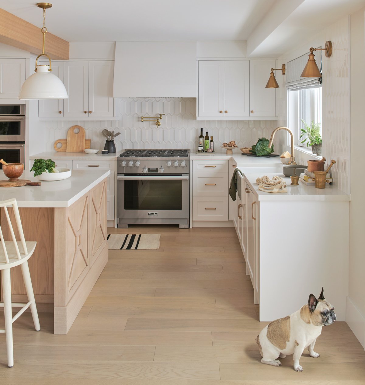
The classic farmhouse X is redefined in the modern kitchen. The pendant lights add a coastal vibe.
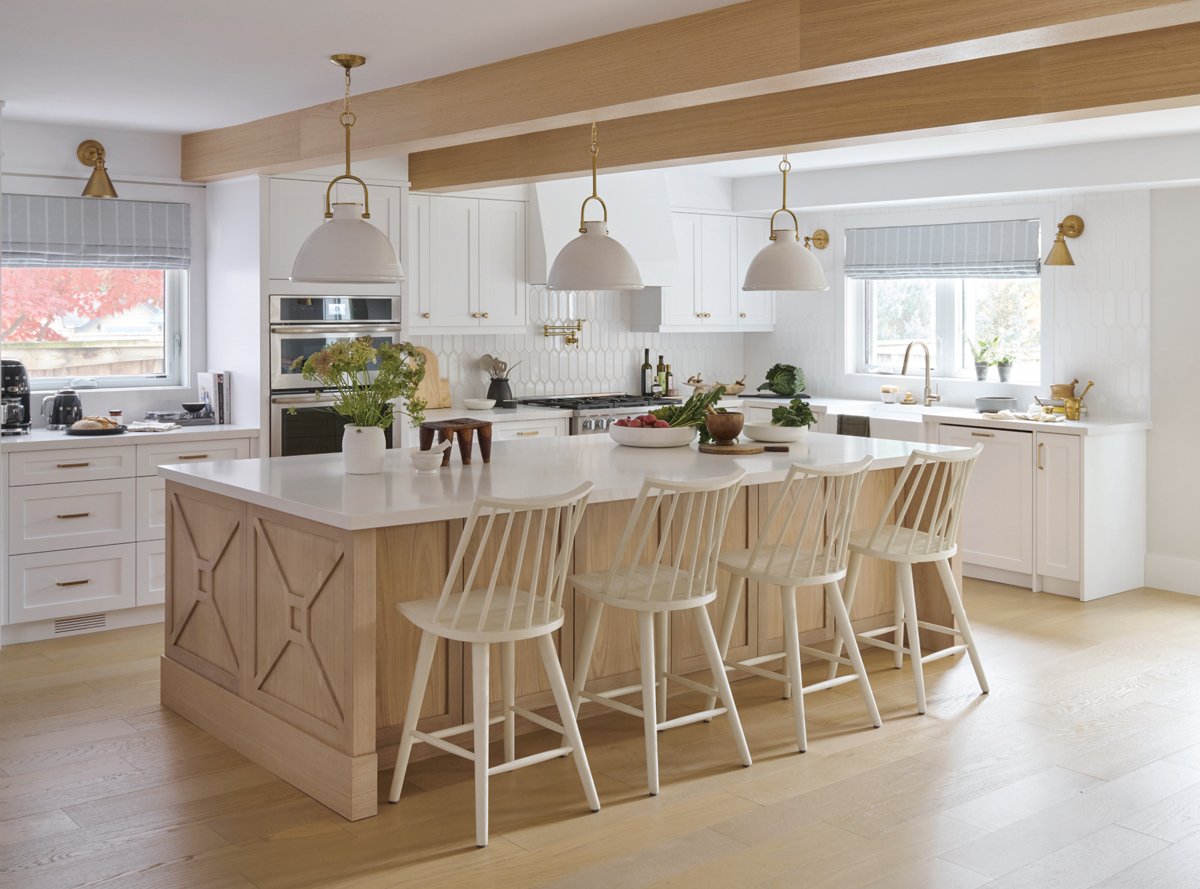
An oversize 10 ft. island is the highlight in the kitchen. “We love to cook and entertain,” relays Jennifer. “We have a big family and we want to enjoy togetherness in our space. The kitchen island is the centre of it all.”
The natural wood island incorporates functional elements on all four sides, and also provides ample seating space.
The warm wood tones pair nicely with crisp white Shaker-style cabinetry by Kraft Custom Kitchens. Classic country touches are incorporated throughout, including white industrial pendant lights and spindle-backed chairs. More contemporary design elements add dimension to the space, like the vertical picket-style backsplash tile.
“Traditionally the farmhouse style can be a bit heavy and dark depending on the materials incorporated,” says Michelène. “With that in mind, our wood elements were much lighter in tone combined with white slab and tiles. Cabinets were kept clean and cohesive by panelling the appliances.”
Wood beams add architectural interest in the living room and match the built-ins.
The kitchen opens to a family room that features a fireplace with a gas insert by Napoleon and a porcelain tile surround. The fireplace is flanked by built-in wood bookshelves. Cosy linen sofas and chairs from Cocoon Furnishings are placed in a free form around coffee and side tables from Muskoka Living Interiors. Overhead, natural wood beams grace the ceiling and blend perfectly with the hardwood flooring by Fuzion Flooring.
A hallway connecting the kitchen and the dining room was once wasted space. The designers incorporated a focal point with floor-to-ceiling cabinetry and a desk overlooking the yard. To create visual interest, the designers replaced the standard square openings with a pair of curved archways to replicate the shape of the windows. Off the pantry area, the dining room incorporates a built-in wine fridge from Tasco Appliances, making it easy to grab the perfect vintage once seated for dinner.
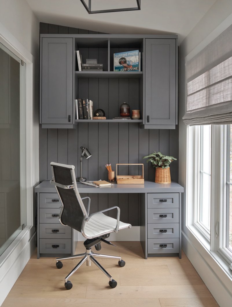
The addition by Cresmark Design-Build provided room for an upper-level office nook withwindows that look onto the foyer.
The new addition allows for a mudroom off the entrance to keep coats, boots, shoes, hats, and scarves organized in built-in locker-style cubbies. A custom upholstered window bench by Lisa Sinclair Sewing and fabric by Tonic Living provides a place to throw a coat, purse or sit comfortably while pulling on a pair of boots. An encaustic floor tile from Centura adds visual interest to what is normally a functional room.
In renovating, Jennifer wanted to keep the small but interesting bathroom vanity in the powder room. Though the original footprint of the room became smaller, the vanity was a perfect fit, and crisp white shiplap and a framed mirror complete the space.
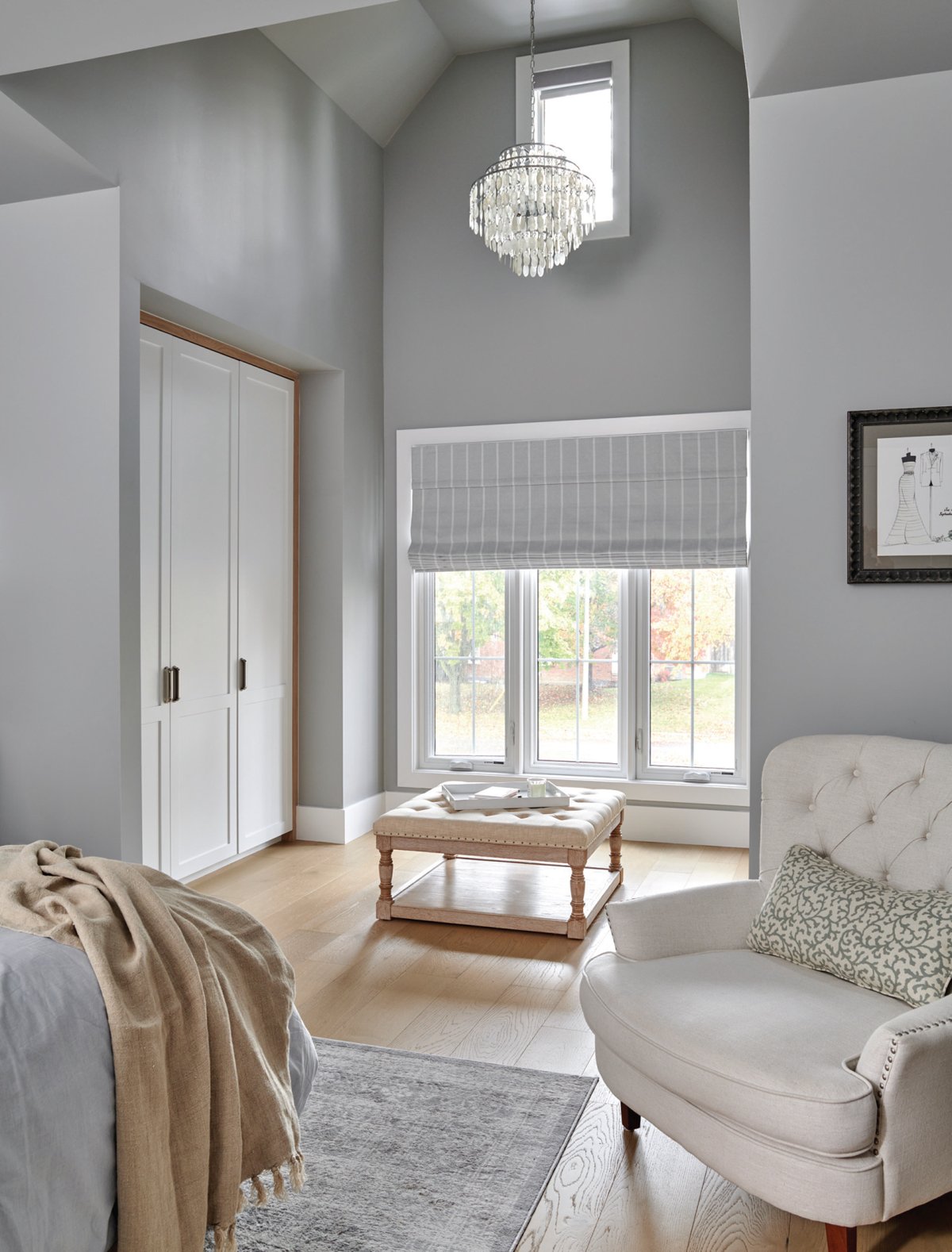
A roof replacement allowed for higher ceilings. The primary bedroom now features a dramatic 14 ft. high cathedral ceiling, two open-concept closets and en suite.
The roof was raised during the renovation, allowing for higher ceiling heights in the upper level primary bedroom. A darker paint hue adds moodiness and additional windows create a serene softness.
“A tub was important to us,” discloses Jennifer. “The original bathroom just had a stand-up shower, and we wanted to find room for a freestanding tub. Ashley and Michelène really came through with a layout that worked.”
The designers found space for the tub near the entryway to the bathroom by placing floating vanities and a spacious shower to the left of the door.
The original bathroom footprint was modified to include Jennifer’s must-have, a freestanding tub. The warm wood tones from the main floor carry to the vanity. Crisp white and hints of metal complete the space.
A home office was created in the upper-level addition. Fabric blinds by Budget Blinds adorn the window. The homeowners also chose to add a window wall to the interior to connect the office to the rest of the home and let sunlight into the foyer.
“I wanted this home to feel warm and inviting in any season,” says Jennifer. “I knew that this light and airy space would be cosy in winter, yet airy and cool in summer. Working with Cresmark and Rüme, I could not be happier with the outcome of this project.” OH
More pictures of this beautiful home—along with other local features—can be found in the Spring 2023 digital edition of OUR HOMES Golden Horseshoe, available to read online at www.ourhomes.ca/the-golden-horseshoe
Changing architectural details can have big impact. The designers swapped the square archways for soft curves that mirror the windows.


