Country Cool: A Bright & Airy Ottawa Model Home
Story: Heather Wright | Photography: Gordon King
Great design should land an impact that is all at once visually pleasing, lifestyle enhancing and, perhaps most importantly, sensibly and stylishly liveable. That’s what homes are like in Cardel Homes’ Creekside development, particularly with the 2,456 sq.ft. modell: The Nichols.
This small enclave is nestled in the village of Richmond. Creekside captures the essence of country living with a sense of open space. Creekside also offers residents convenience, with necessary amenities literally right next door. Picture running out of an ingredient while making dinner, strolling to the grocery store and being back before your dish is even done. It’s also well-located for commuters, within easy access to multiple points in the Ottawa area.
Unlike some suburban neighbourhoods that can be homogenous, Cardel takes proactive steps to make this community more visually rich and eclectic, by integrating several different elevations (The Nichols alone has four) into the streetscapes.
The Nichols is literally a collection of smart spaces that combine to create a stunning home. There is a dual experience when you are in this home. On one hand, you are taken with the clever décor elements and details, predominantly done in deep contrasts of black and white. On the other hand, this home gets you on a deeper level as you move through it, realizing just how intelligent its physical design is. The Nichols isn’t just a pretty face; it is a home with substance to its spaces.
When you recognize that it is function, not fashion driving the design, it’s no surprise to learn that Richard Bukarewicz, Cardel’s vice president of architecture and design, takes a decidedly pragmatic approach with his designs. He draws on 27 years of experience creating homes for Cardel. “I do a lot of space planning. I add furniture to all rooms to see how it fits and get a sense of the design layout. I also consider traffic patterns and how people would move through the home,” he says.
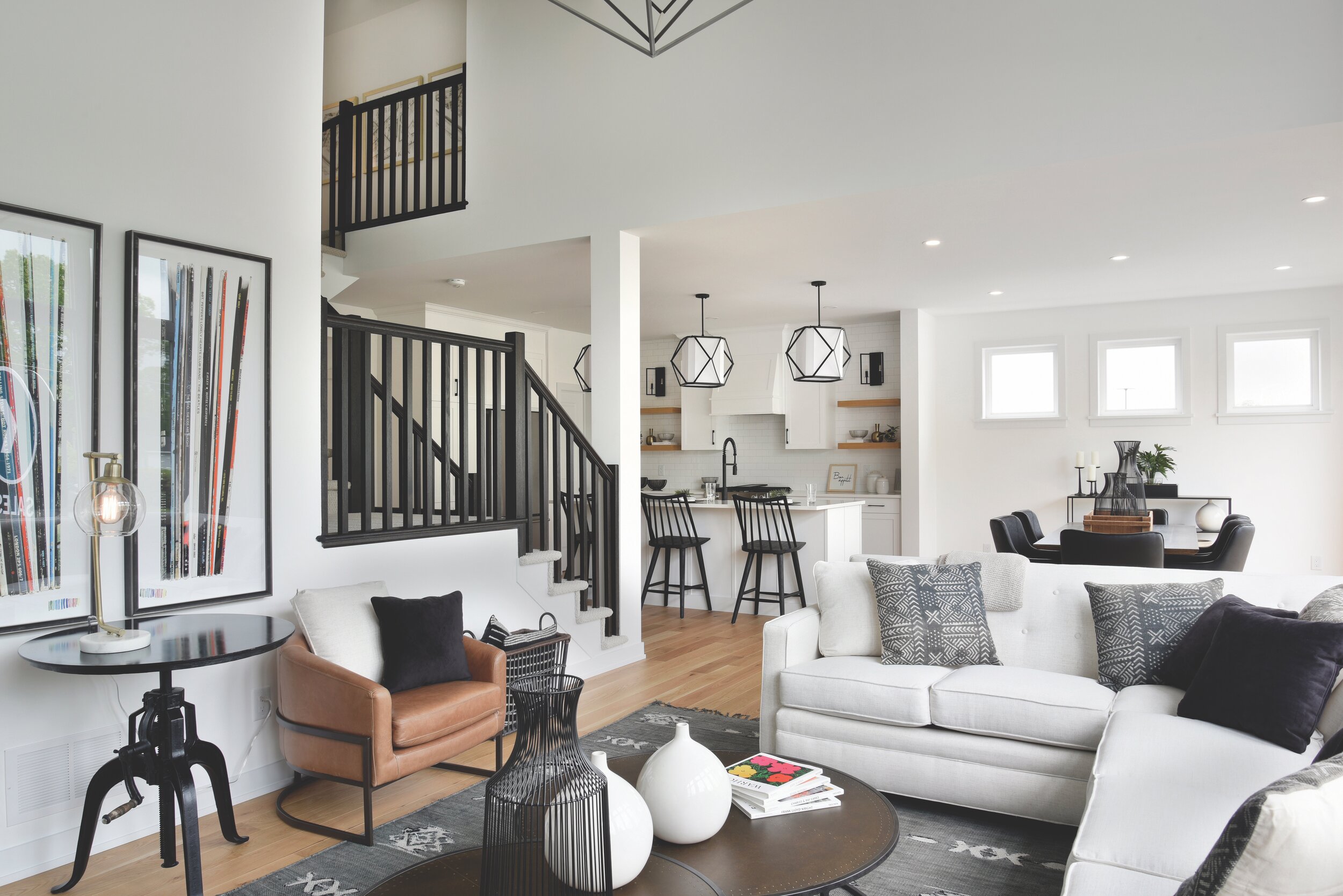
This is evident in the sun-filled kitchen by Deslaurier Custom Cabinets, where the space is unbelievably intuitive. Beyond the smart layout and well-placed, ample storage, the design details are generous. A wide island serves as a jaw-dropping focal point with a deep fashionable Blanco sink for prep that is also placed perfectly for traffic flow. Just behind are open shelves on either side of the Zephyr hood fan, supporting the fusion of contemporary and country farmhouse that dictates the décor.
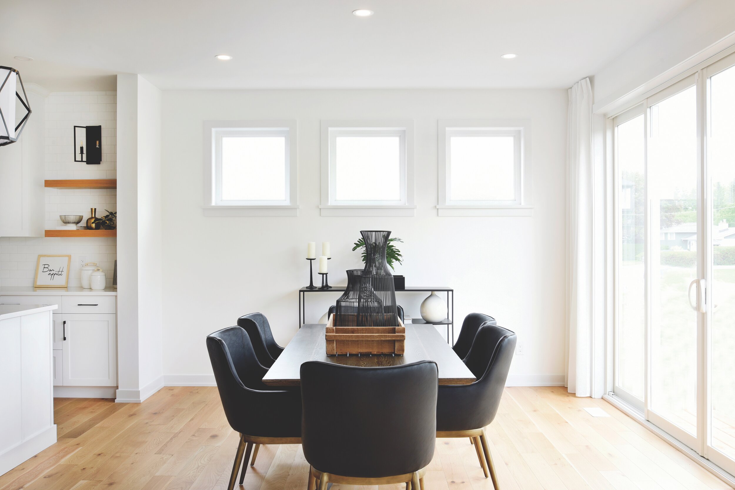
The angled ceiling in the great room is one of the more stunning details of the home. “We wanted the great room to feel cosier. That’s why we chose to do a vaulted ceiling with wider architectural windows,” says Richard. Extra-large patio doors extend the sightlines and graciously usher in all kinds of light in the adjacent dining room.
The traditional farmhouse feel is brushed pleasingly with a contemporary edge. Take for example, the Napoleon fireplace in the great room, set against shiplap. The result is striking both with the contrast and the texture, giving this room a unique appeal that stays with you long after you leave it.
The upstairs features four sizeable bedrooms, all with lots of storage (all closets have swing doors) and large windows.
There are a few features in this home that families in particular will really appreciate, like the second-floor laundry room and separate zones in the family bathroom to make life easier with kids. Downstairs, there is a sizeable mudroom right off the garage to contain indoor/outdoor messes.
The Nichols is rife with housing “aha” moments, which is reflective of Richard’s design philosophy. Taking a cue from shifting lifestyles, like all fashion-forward moments, this home hits just beyond the trend lines with some impressive options.
Those who work at home will love the optional flex room situated at the front of the home. There is the option to use this as a formal dining room, but its location and space considerations make for a dreamy home office, with subtle but definite space division. Clients can enter the office space and make use of the front hall closet. They can even use the powder room. This flex room is positioned in such a way that visitors don’t automatically have a direct sightline into the home, as you would in some other entryway designs. You can even have an extra door to define the space physically.
Another option that The Nichols offers is another main floor flex room, just removed from the living area. This room could have a variety of uses, including a Nanny suite or for an in-law suite. The placement of this room demonstrates how home design can proactively address a shift in how we use and inhabit our living spaces, in this case with the rise of multi-generational living.
Cardel prides itself on the concept of design being a collaborative experience where homeowners are presented with inspiration and then given the support and tools to build the home they want.
“Many different people will find value in the design because of how flexible it is,” says Richard. “The Nichols shows an example of what is possible and then homeowners are invited to work with the interior design centre to tweak it as it suits them. From there, the design just falls into place.”
Cardel’s tagline of “built for real life” isn’t just catchy marketing. It’s a philosophy where the goal is to design homes to elevate and streamline daily routines, as well as create spaces that support lifestyle.


