Bespoke in Barrhaven
STORY BRIANNE SMITH
PHOTOGRAPHY GORDON KING
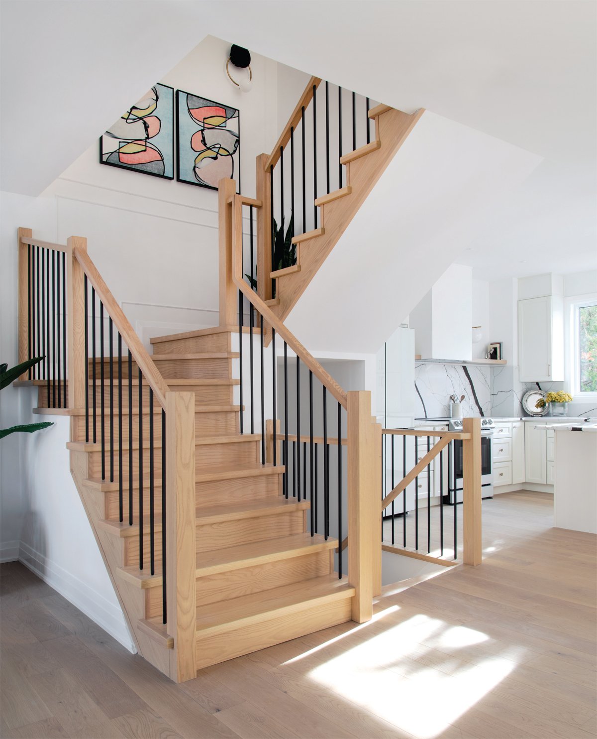
The stunning staircase is a focal point unto itself, with ample space to display artwork and millwork for wow factor.
When Terzetto Homes founders Vivian Wu and her husband Yishi Pan came across a two-storey home nestled in Barrhaven, they knew right away it was the perfect design challenge for their team.
Built in 1998, the 3,891 sq. ft. Minto model home had been unoccupied for over a year before Vivian and Yishi came across it in their search. It was in need of some TLC.
For Vivian, remodelling the home on spec provided a blank canvas to bring all her design visions to life and put her team’s creativity to the test, taking into account the features and décor elements that a stylish buyer would be seeking in this family-friendly neigbhourhood.
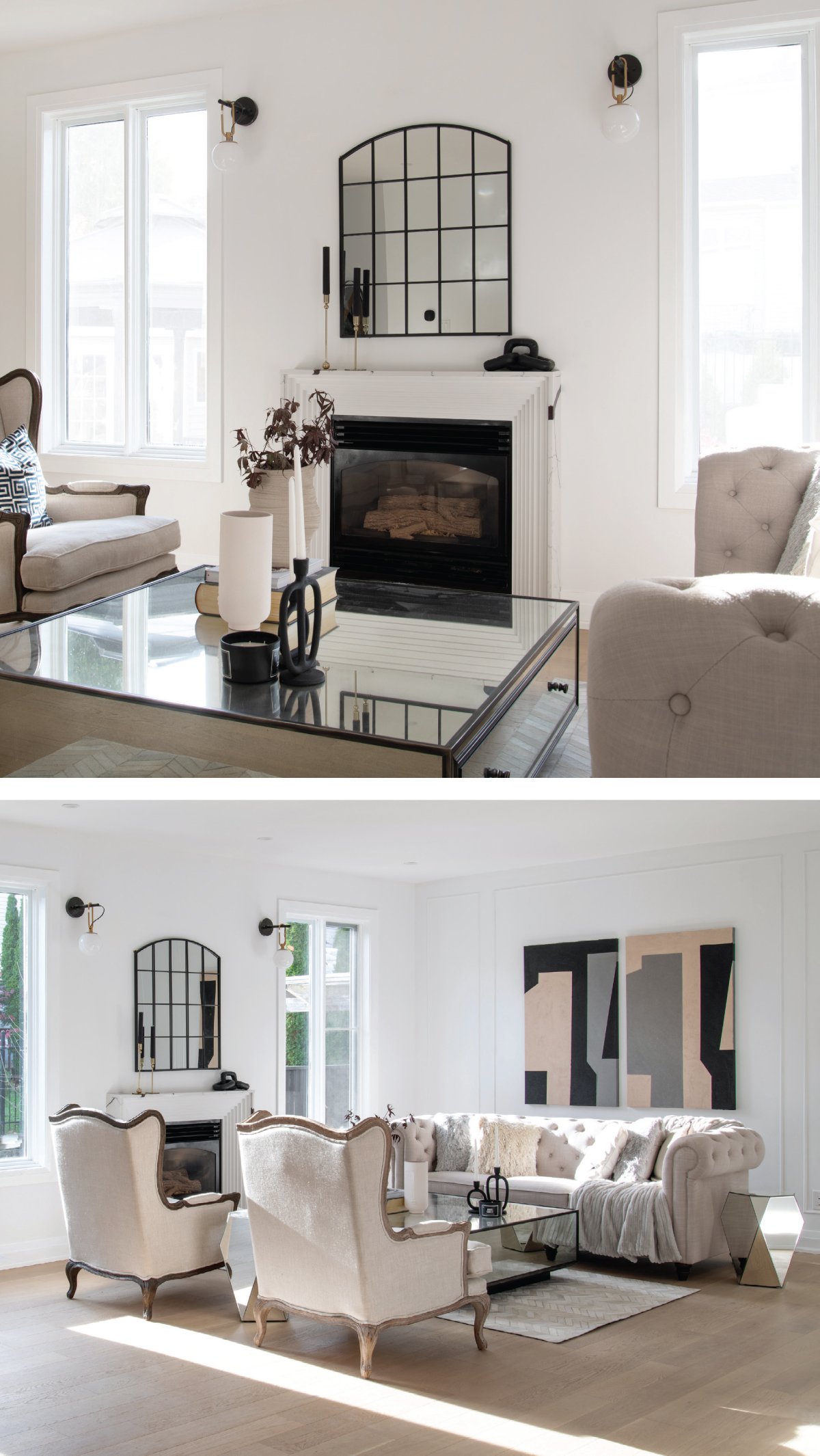
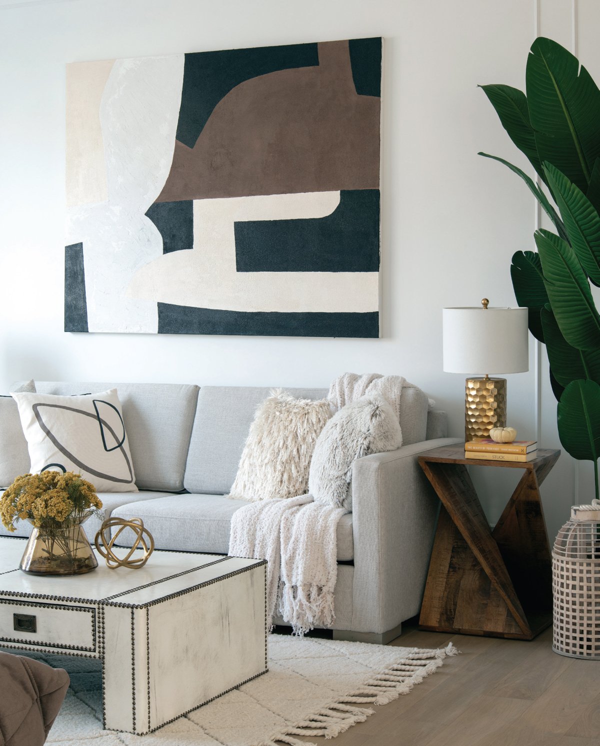
Vivian says “My style is a lot of white. When I did this project, it was all about the details.” Design details abound in the open main floor, with wainscotting, bold, colourful artwork and simple but impactful light fixtures.
OUR HOMES spoke with Vivian Wu of Terzetto Homes about the project:
OUR HOMES: What initially stood out to you about the house?
Vivian Wu: This was the perfect house for my own ideas. I thought “ok the neighbourhood looks pretty good,” and the size of the lot is very nice as well. Curb appeal was nice, as it is the only three-car garage in the neighbourhood. It had been a model home for Minto. The square footage of the home was good as well and would allow for us to make the changes we wanted.
OUR HOMES: How extensive was this project?
Vivian Wu: We demolished everything, just left the bones, exterior siding and roof. Inside it was completely gutted and renovated.
OUR HOMES: How did you modify the floor plan?
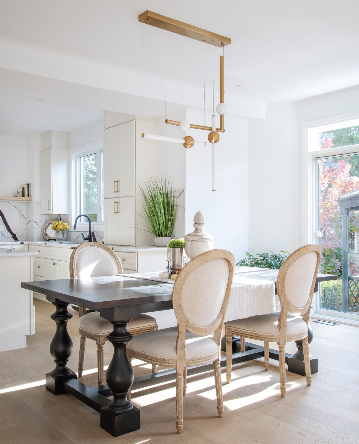
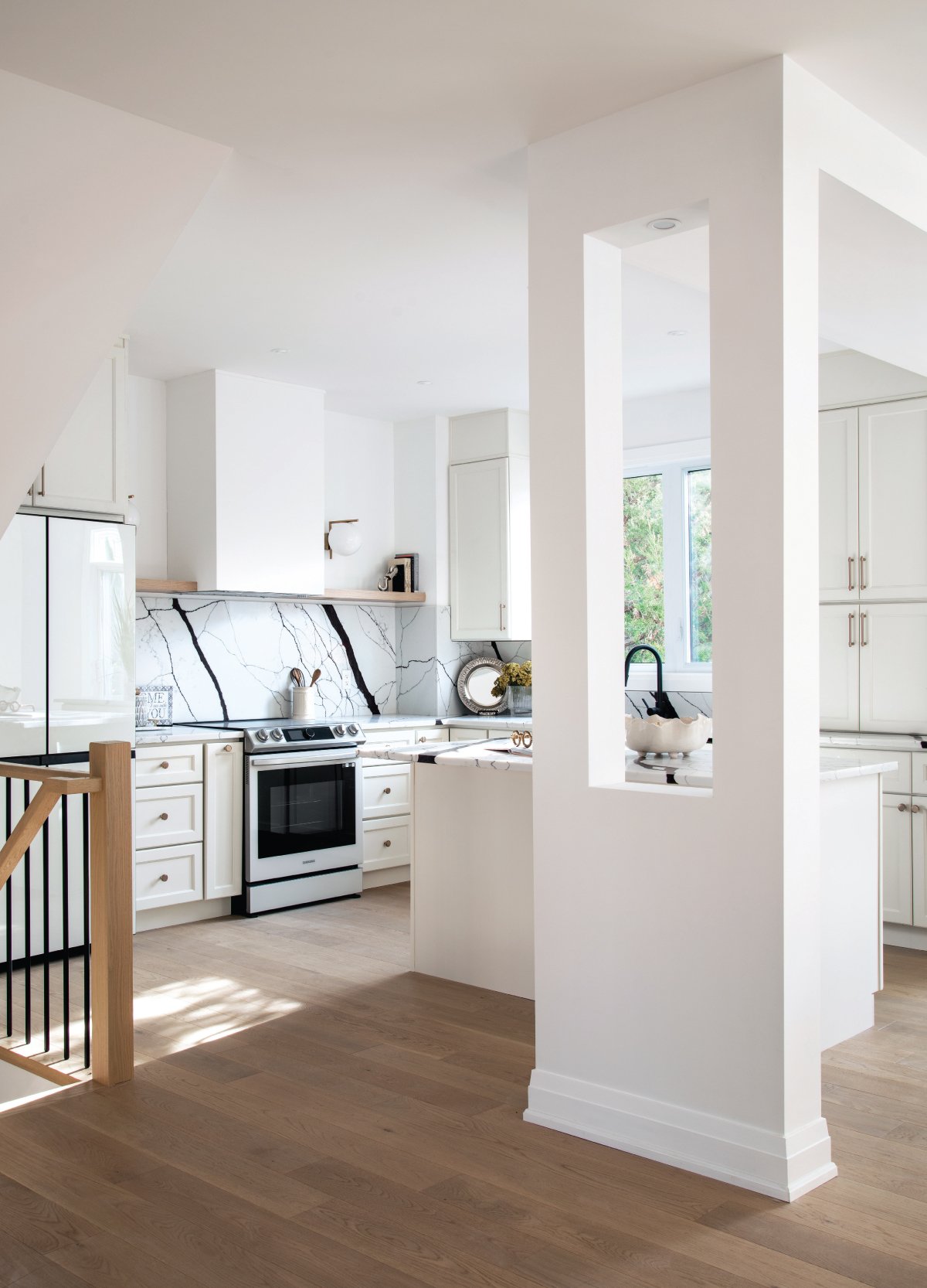
Vivian Wu: On the main floor, we redesigned the footprint so the kitchen was in the middle of the house. We flipped the kitchen and dining room. I wanted to have a different flow, because where the kitchen used to be there was a wall blocking the view and dining area, so we opened a wall, relocated the plumbing and resized a window. Personally, I love to wash dishes when there’s a window to look through. Now, you can see throughout the backyard. (All faucets and kitchen sink from Pearl.)
Upstairs, we re-configured the primary bedroom and the second bedroom and both now have their own bathrooms using space that used to be the laundry room. We moved the laundry room to the first floor to combine with the powder room. In the end, we added an additional bedroom and bathroom to the second floor.
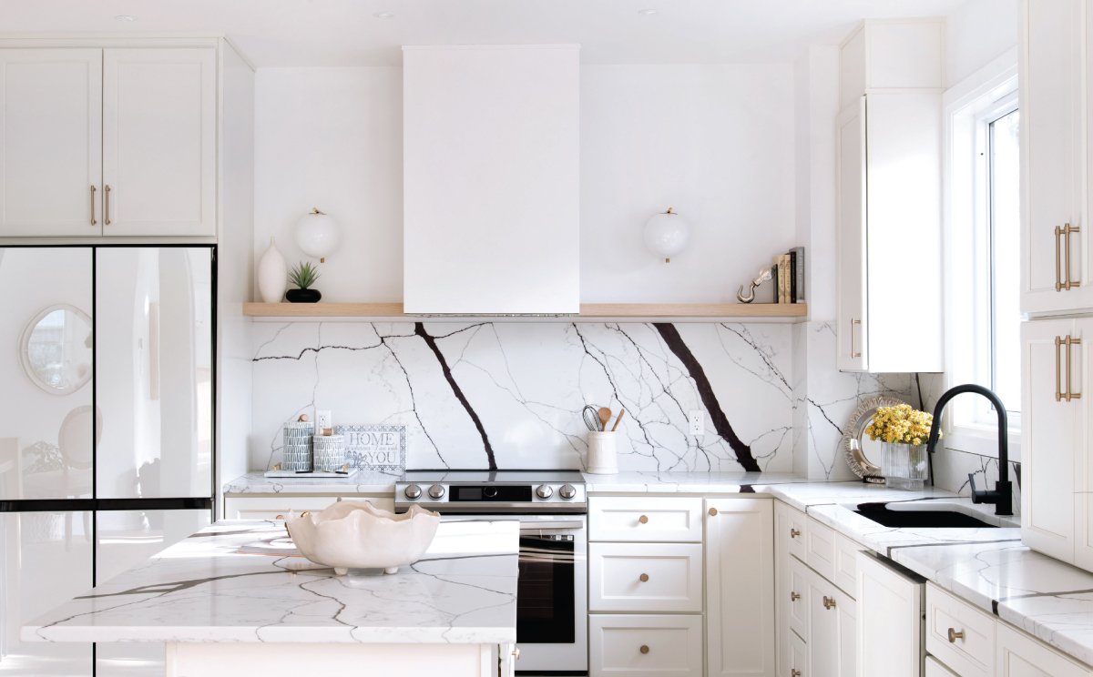
Easily the showstopper in this home is the stunning stone in the kitchen, with its elegant dark purple veining. With such an eye-catching island and counters, the supporting details are subtle, but also striking – like the open shelving, brass hardware and pull-down faucet and sink from Pearl.
OUR HOMES: Tell us about the quartz on the kitchen island and backsplash.
Vivian Wu: There’s no one in Ottawa who has that stone, I personally imported it from a factory in China. It has a European look, with a white base and dramatic dark- purple veining. I felt I had to use the slab somewhere in the design of the home, and it is a key part of the overall décor. It made sense in the kitchen because of how visible it is from much of the main floor.
OUR HOMES: How is the open kitchen and living area central to the design?
Vivian Wu: I see a family living in this space. I believe the kitchen is the heart of the house. They will spend lots of time in the kitchen because of where it’s located in the house. The dining table is close to the kitchen, since it’s not a large island they can utilize that dining table space – they can chat or have a drink.
This cosy nook was converted to a reading room, where Vivian envisioned the homeowners curling up with a good book at the end of a long day.
OUR HOMES: The reading room you designed is special. What went into that design?
Vivian Wu: Tucked in at the front of the house, next to the foyer, this room was there originally, and we didn’t alter the physical space. Instead, we used colour and décor to make this room feel cosy and have a purpose. In the new home, we designed the room as a space for a family to read and chat. There’s a nice big window, making the most of natural light and nature outside.
Outside of the window there’s a beautiful big tree, so from the window in this room you can watch all four seasons changing. I was standing in this room a lot during the fall when you can see the leaves change and I thought of how beautiful the colours were on the tree, framed through the window. For this room I imagine a family and kids going back to this room after a busy day, lying down on the sofa and putting a lamp on as the sun begins to go down.
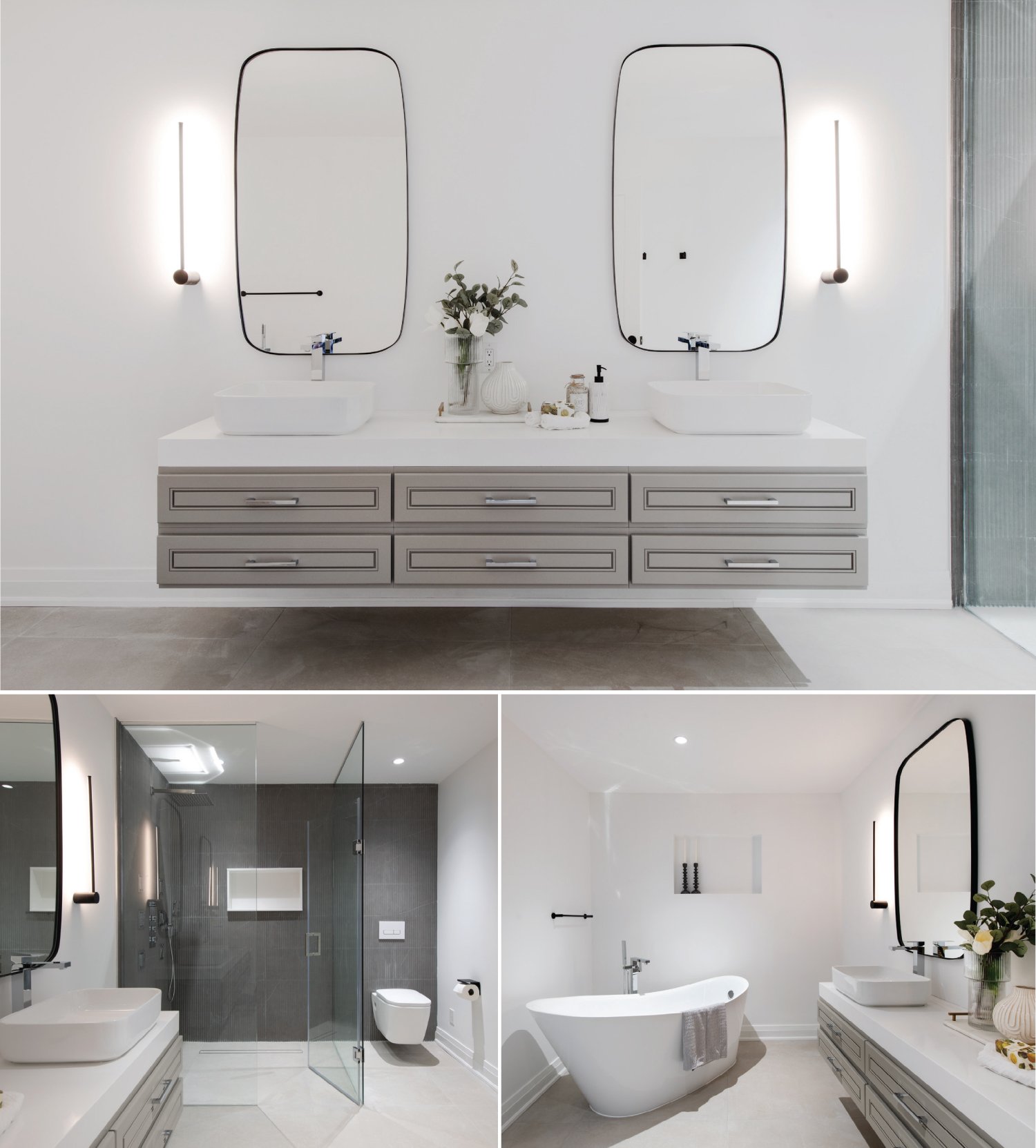
The sprawling primary en suite was modelled after high-end hotel suites that Vivian had visited while travelling. The goal was to use colour and physical design to create a space within the space to invite rest and relaxation.
OUR HOMES: What inspires you?
Vivian Wu: I love to travel, and when I go out travelling I want to make sure I’m staying somewhere that’s comfortable and cosy. The journey is made better by a great hotel with great design.
For the en suite, I wanted to bring that elegant high-end feel, like you’re in a hotel. The colours, the lighting, the fixtures, the tiles (Euro Tile & Stone) and the tub. It’s a great place to go after you finish your dinner and want to have a bubble bath and relax. When working on the project I imagined myself lying in the tub (Tierra Décor) and how I would feel and what I would be looking at.
My travel inspired the primary bedroom too. Originally there was a cathedral window and we removed the trim around it. I had travelled to Greece and been inspired by design I saw there, where there was no window trim for a natural, neutral look.
That’s one of the reasons I love travelling – for the inspiration. I’m always like “what’s this, what’s that? What’s the material in this?” And then I go back and start to explore different materials and look for ways to include them in my projects. OH
Vivian welcomed the transformative opportunity this project offered her. “I love design, I love the feeling after we complete a project how the house turns into another style.It makes me fulfilled with what I do.” The primary suite, pictured here, occupies new space in the altered footprint of the second floor.

